Celebrating Pride Artists
Meet the artists
About the program
Talented artists from across Canada between the ages of 19-24 had the opportunity to participate in a one-day Art on Sneaker Workshop + Competition, powered by eBay Canada and MARTK’D. Participants learned from Dr. D’Wayne Edwards and friends from Pensole Lewis College around colour application, storytelling and product presentation, as well as ecommerce principles from eBay Canada.
Each artist had 48-hours to apply learnings from the workshop to create Pride themed art on PUMA sneakers.
Explore below to meet the artists, see their creation, and bid for your favourite design
Get to know our Pride artists
DESIGNED BY
Mallory Bell
DESIGNED BY
Ailah Carpenter
DESIGNED BY
Shea Coughlan
DESIGNED BY
Freida Wang
DESIGNED BY
Romario Smith
DESIGNED BY
Amir Awad
DESIGNED BY
Rishnika Boteju
DESIGNED BY
Olivia McCarthy
DESIGNED BY
Sage Milner
DESIGNED BY
Erin
DESIGNED BY
Asmita Kaushal
DESIGNED BY
Monia Mugabekazi
DESIGNED BY
Madison Cook
DESIGNED BY
Finch
DESIGNED BY
Christy Simon
DESIGNED BY
Laurel MacKay
DESIGNED BY
George Chakhunashvili
DESIGNED BY
Nick Ghasemi
DESIGNED BY
Mathias Ball
DESIGNED BY
Sara Sian
DESIGNED BY
Darren Uzelman
DESIGNED BY
Ange-Lyne Patenaude
DESIGNED BY
Isaiah Wilson
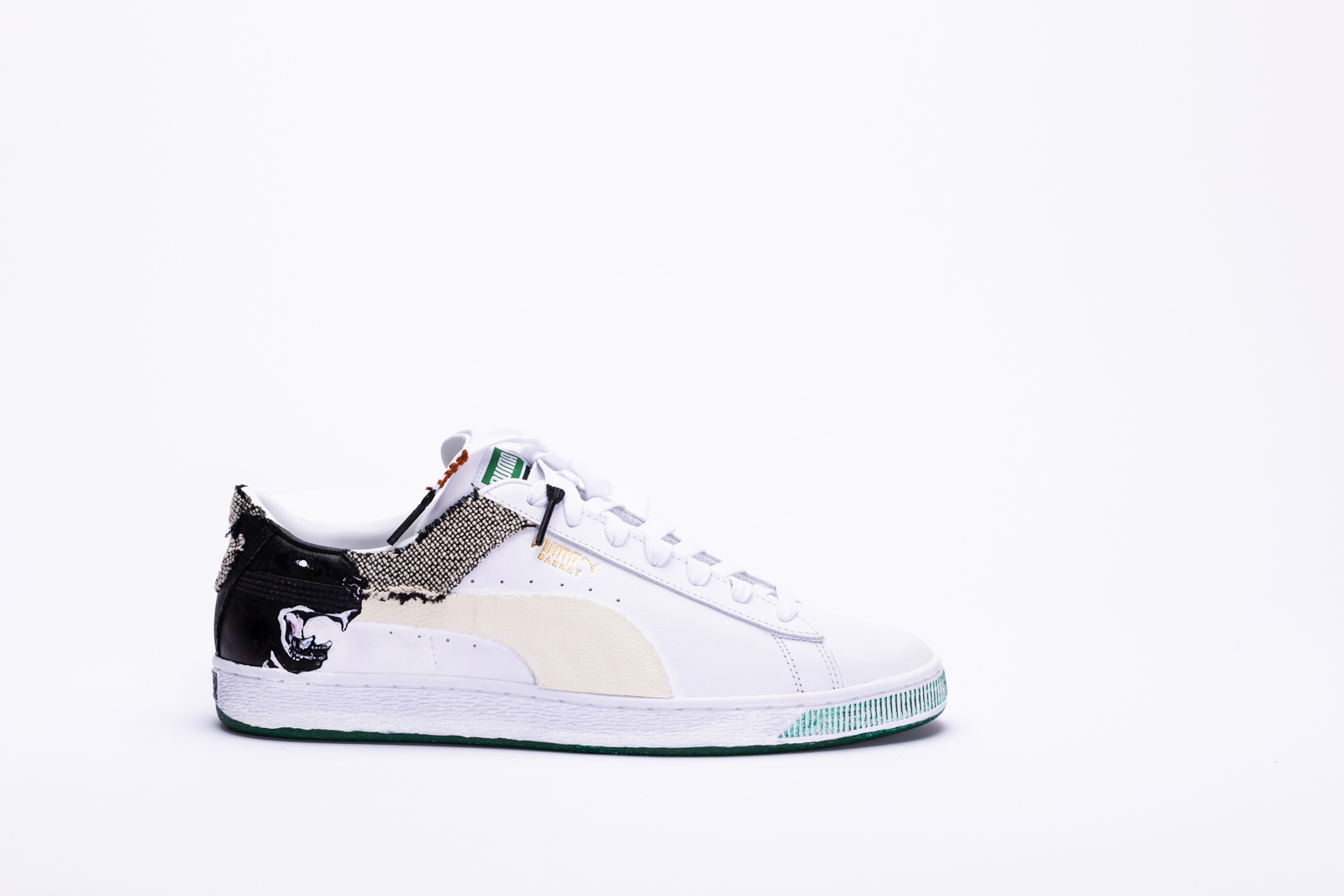
DESIGNED BY
AXNK
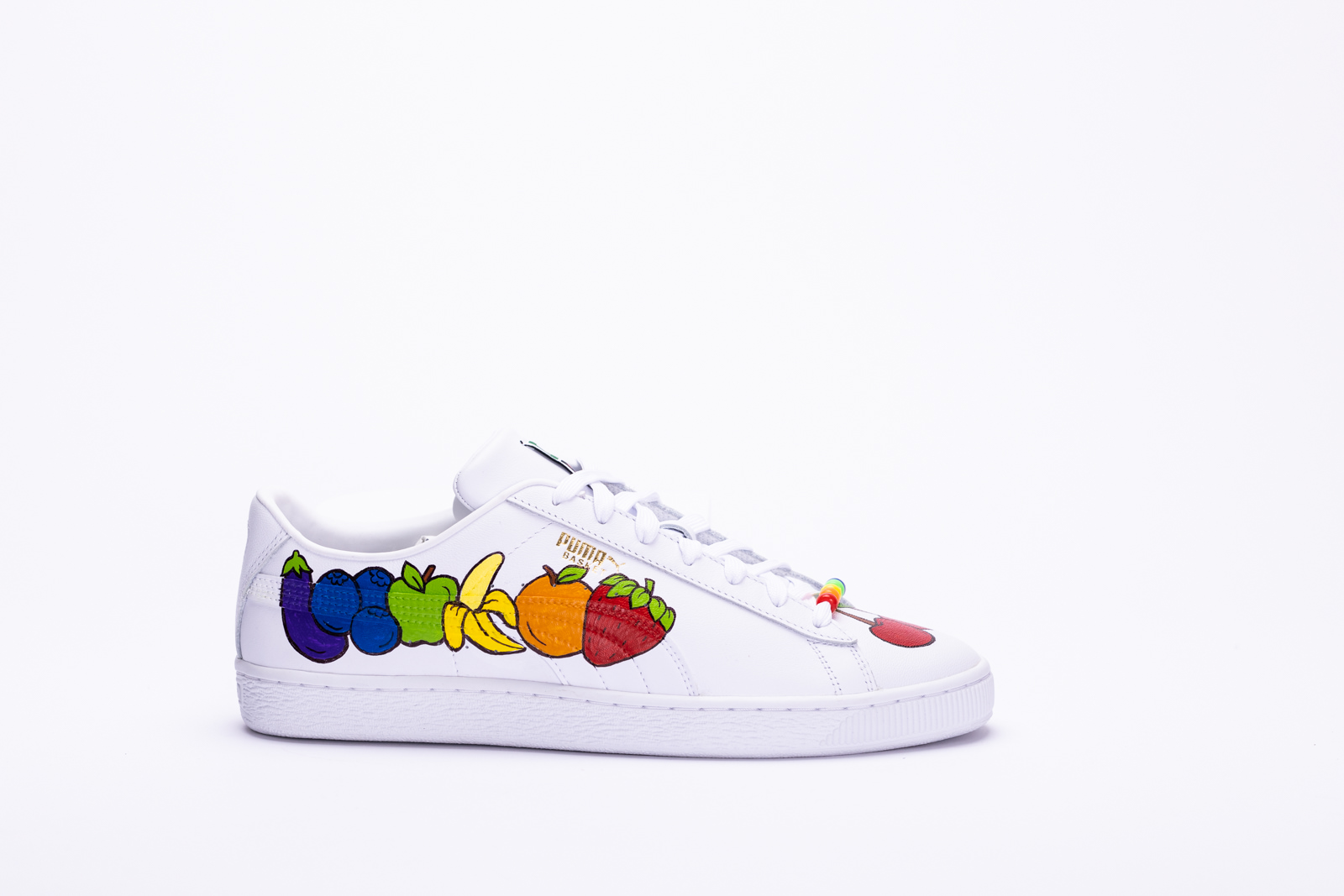
DESIGNED BY
Maryasha Yarmush
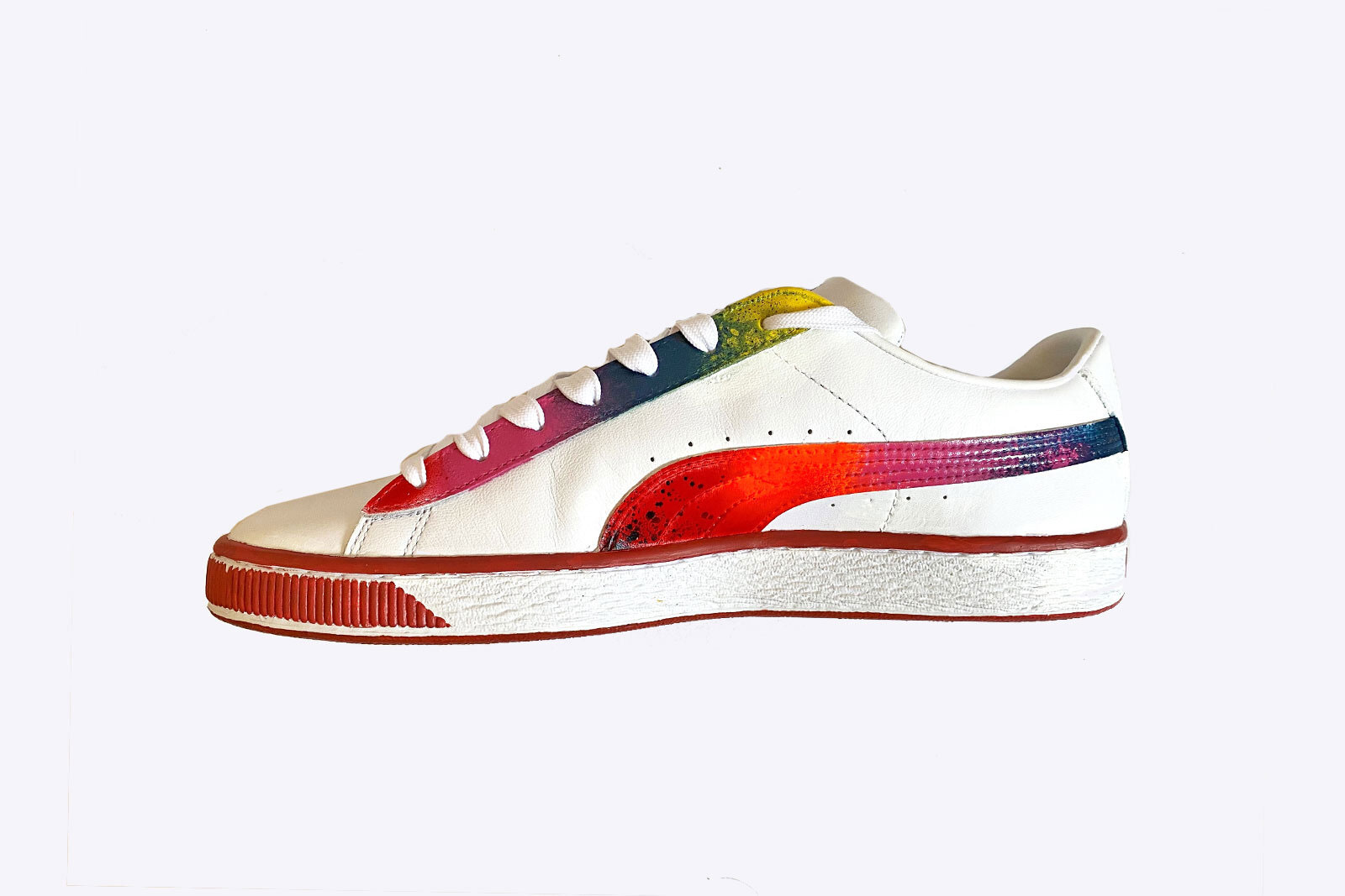
DESIGNED BY
Maggie Pan
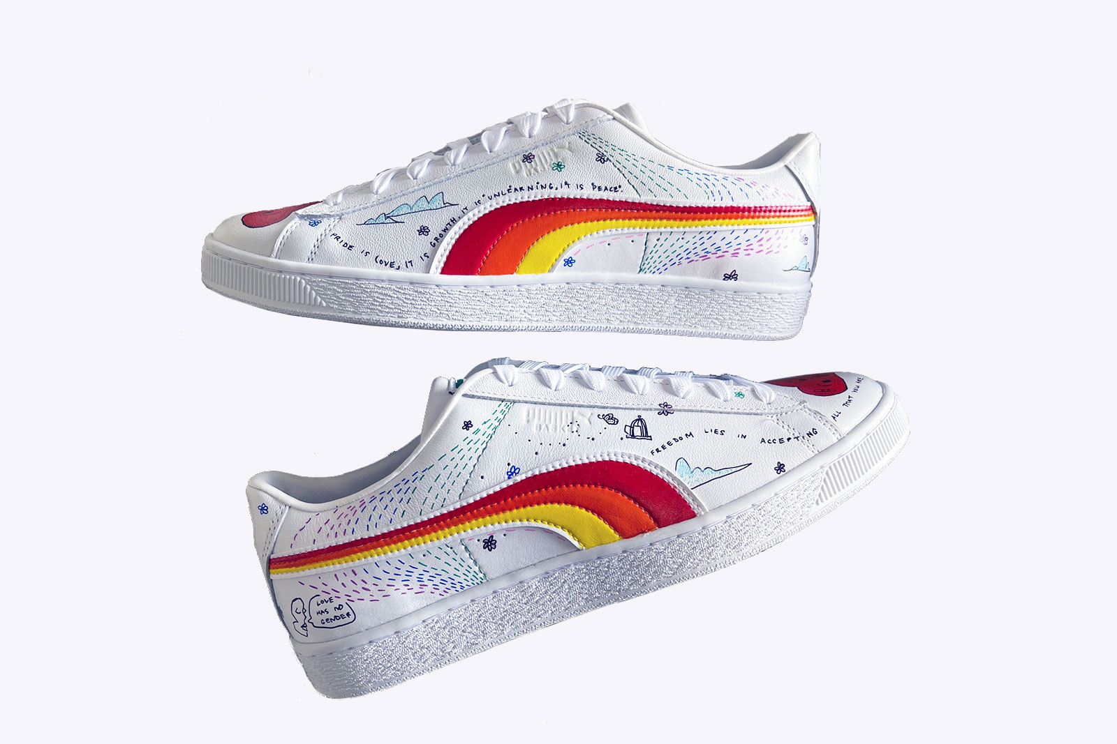
DESIGNED BY
Hani Pathan

Want to score your favourite Pride Art on Sneaker design?
All of the sneakers will be part of an eBay Canada auction, with 100% of proceeds supporting the Pride and Remembrance Foundation. Auction is live June 24 and ends June 30, 11:59pm ET.
The Pride and Remembrance Foundation's mandate is to provide financial support to registered charities that benefit the LGBTQ+ community. These benefits may include individual projects, services and/or activities that provide health, educational, legal, social, athletic, cultural or other charitable benefits.
Bid nowESC

Mallory Bell
Surely once you too were a delicate child:
come now, sing this, all of you, add your voices
to our celebration and grace us with your
company [
– Sappho
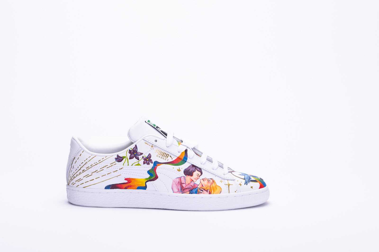
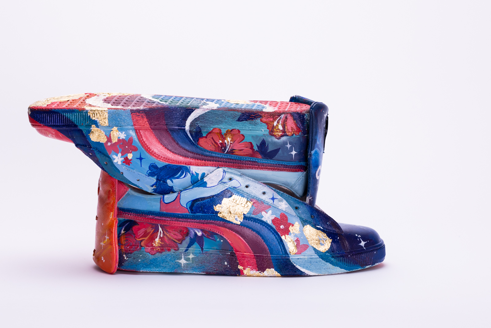
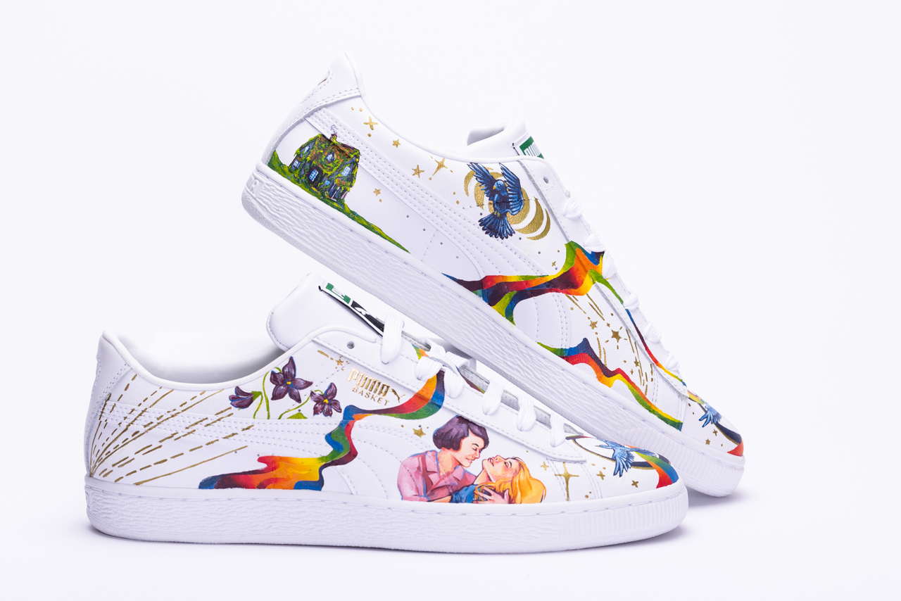
Pride is more than just a celebration of queer identities; it is a celebration of both the struggles and successes in queer history. In order to represent this, I turned to one of the earliest queer poets: Sappho, an Archaic Greek poetess known for writing on themes of wlw (women-loving-women) love.
The overarching motif of the shoe are rainbow auroras that move across the shoes without regard for the physical panel design. The rainbow represents the original pride flag, while the free-flowing movement across panels represents how queer people are often seen as breaking gender and sexuality boundaries put in place by society. Also depicted across the shoes are birds representing freedom as they take to the sky, as in the lines:
Then beautiful swift sparrows led you over the black earth
from the sky through the middle air,
whirling their wings into a blur.
The right shoe features two women holding each other and smiling intimately, while the left shoe depicts a close-up of clasped hands; both of these are inspired by vintage black and white photos. Again, this ties into one of the main themes of Pride: celebrating the relationships of LGBT people of the past who may not have had the same freedoms, acceptance, and opportunities as queer people have now. I chose to again tie this imagery to Sappho’s poetry adding violets, as well as giving one of the women violet hair, as these flowers are a representation of sapphic love:
maidens [
all night keeping vigil [
make a song someday of your love and of your
violet-lapped bride.
On the inside heels of each shoe are two more images related to Sappho’s poetry. The boat is a reference to the line that even ships are not as beautiful as what one loves:
Some say an army of horsemen,
some of footsoldiers, some of ships,
is the fairest thing on the black earth,
but I say it is what one loves.
This could also depict the story referenced later in the same poem of Helen leaving the city of Troy, sailing away to follow after the goddess with whom she has fallen in love. In a broader sense, the ship can also symbolize journeys and exploration, which are themes young queer people often find to be resonant as they explore their own self-identities. Contrasting the ship, the cottage overgrown with vines on the other shoe’s inner heel represents the safety of home. Many young queer people dream of finding a safe place to call home where they can be accepted and loved, where they can take root in order to grow into their best selves. Together, the ship and cottage combine to represent the possibilities of the future.
The imagery all around the shoes are tied together by gold detailing portraying stars, rays of light, and phases of the moon. Sappho speaks of the splendor of the stars in one of her fragmented poems, personifying the moon as a beautiful woman to whom Sappho speaks lovingly:
As the stars surrounding the lovely moon will
hide away the splendor of their appearance
when in all her fullness she shines the brightest
Gold lines and stars also spill out from the illustration of a face on the left shoe, representing the voice of Sappho’s subject, likely the woman she loved:
listening from closeby to the sweetness of your
voice as you talk, the
sweetness of your laughter: yes, that—I swear it—
sets the heart to shaking inside my breast, since
once I look at you for a moment, I can’t
speak any longer
Alternatively, these gold lines could represent the voice of the Poetess herself, or even the collective voice of all queer people throughout history. In today’s world, Pride allows us to amplify our voices and celebrate our stories and emotions just as Sappho did in her time.
Sappho, and Jim Powell. 2007. The poetry of Sappho. Oxford: Oxford University Press.

Ailah Carpenter
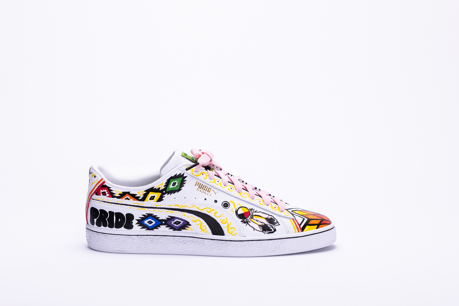
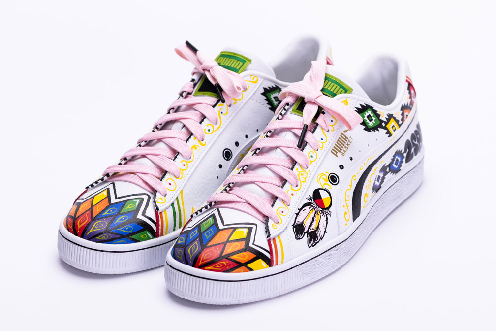
The inspiration behind my sneaker customization comes from Two-Spirituality, which exists in the LGBTQAA2S+ as “2S”. It's close to my heart because of its meaning, my two-spirit family and friends, and my identity; I am a mixed Indigenous person, who identifies under the “2S” umbrella.
The details on my sneakers are based on imagery I saw throughout my life. As a child, I was raised to experience ceremony, dance, and traditional Indigenous art, which I wanted to include in my design. On the toe of the sneakers, I recreated the star blanket design, which is something my great-grandmother gifted me as a newborn; She was the late Vicky Wilson, a survivor of residential schools. Along with the top opening of the shoes and below the iconic puma swipe, I incorporated Navajo designs, which I often saw on my blankets. The colour story relates to pride colours that, when paired with the medicine wheel and feather icon, represent the Two-Spirit flag. I utilized bold colours and rich black to compliment the shoe's design and to contrast the rest of the white canvas. However, I needed to balance that contrast, so I strategically coloured the shoe with yellow and pastel pink details.
Two-Spirit peoples were once openly accepted in our communities; they were believed to possess both the feminine and masculine spirit, hence the term. Due to this, they held significant roles, such as healers, ceremonial leaders, and storytellers. Two-Spirituality was a spectrum, recognizing the unique experience of love and gender identity without concrete labels like we have today. However, with the arrival of colonization in the Americas came the colonial view of sex and gender. The hatred and violence towards other identities, let alone the indigenous race, practically wiped out Two-Spirit peoples; on top of the prejudice that indigenous people face to this day, Two-Spirited people face discrimination from much of their kind who have been changed to believe that queerness of any form is shameful.
My genes may be mixed, but my feelings about the cultural significance and importance of the Two-Spirit identity are not. With my art, I want to impact all of Canada, my people, and those who tried to erase us. I believe it's critical once again to accept our Two-Spirit people as people; we must recognize their validity and continued importance in rebuilding our communities. As someone from that community, I believe being loud and proud of my identity will contribute to representation and positive change, so I chose Two-Spirituality as the subject to display on my sneakers.

Shea Coughlan
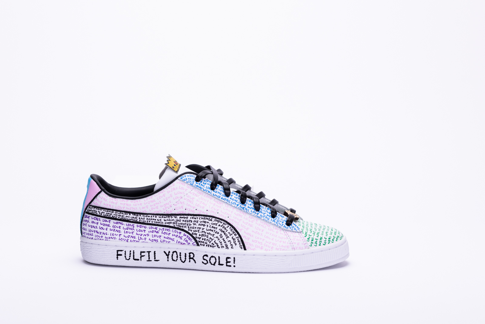
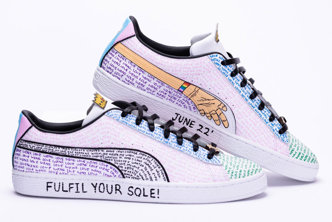
I believe that Pride is the acceptance and celebration of authenticity, self-discovery, and love. I embodied these characteristics within and throughout my design. As an artist, I gravitate to colour blocking and design that compliments the canvas I’m working on. I communicated this through the multiple panels of the shoe which are filled in with colours of the Pride flag. That is what felt authentic to me and is the first aspect of Pride representation. The second; self-discovery, is embedded within the creative process of this pair itself. As I was coming up with the original concept, I was thinking about the important people in my life that reside within the LGBTQ+ community and the impact they’ve had on me. I used these moments of reflection to truly understand how I’ve grown alongside these people not only as an artist but as a person as well. I took these moments as both inspiration and moments of growth. Finally and arguably most importantly, I believe that Pride is a celebration of love in all of its forms. The famous quote and title of the piece, “Love Wins”, is the phrase that makes up all of the coloured panels. Additionally, I have included the lyrics to the chorus of “Same Love” by Macklemore on two panels of the shoe. This song resonates with me and what it means to accept everyone as they are. That is why I chose to include a piece of it within this design. Overall, this is what Pride means to me and how I’ve embodied it within my artwork.
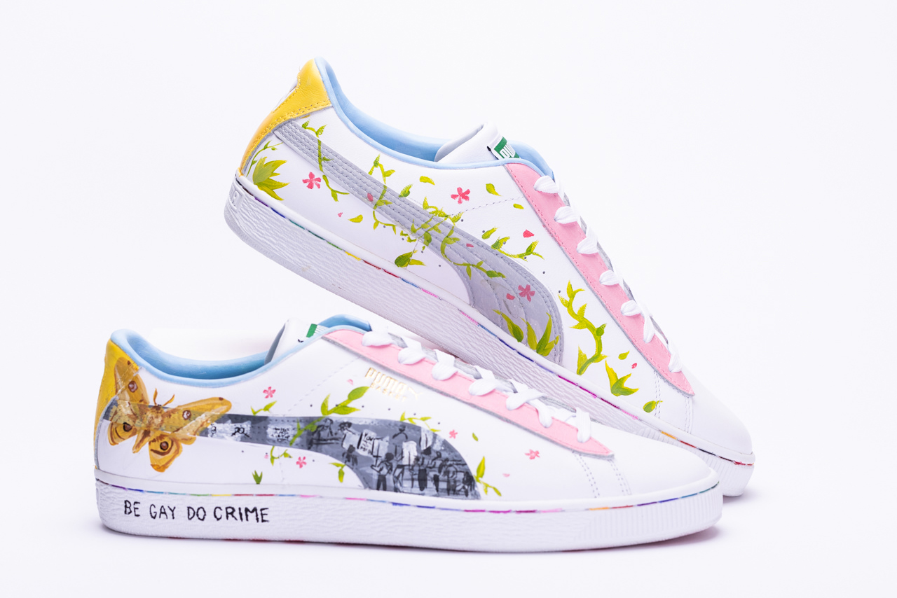
Freida Wang
With my design I ended up with on the shoes, I hope to both pay homage to the past and represent my thoughts on my own identity today.
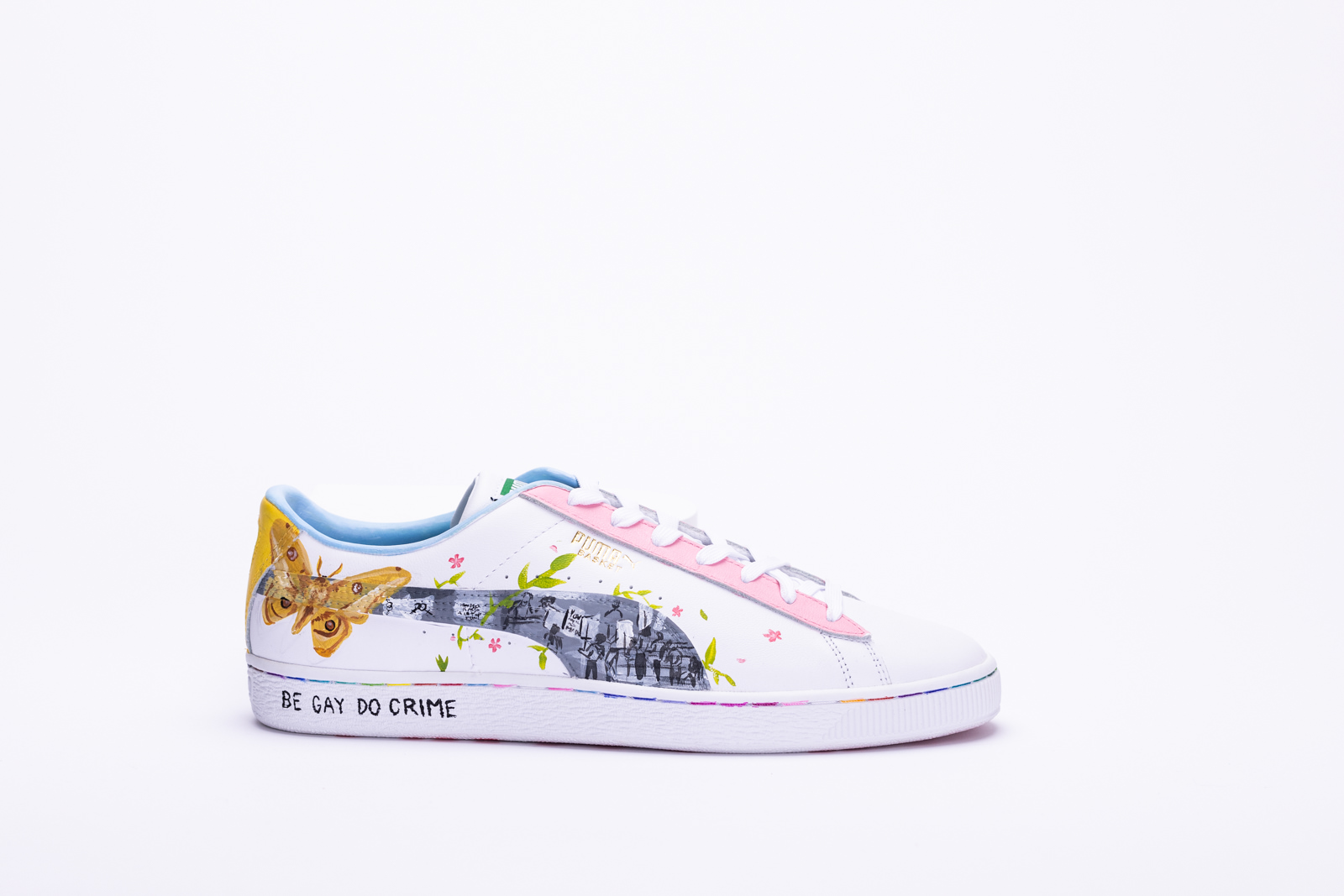
I wanted to pay respect and homage to those who came before and paved the way for LGBTQ+ people today to be able to celebrate pride though there is still a way to go in terms of reaching equality. The stitching across the bottom of the sole are coloured with the pride, trans, bisexual and lesbian flags; representing the way the community is intertwined and the aspect of community at the root of pride. The text across the bottom of the soles are both in reference to a meme collectively known across the LGBTQ+ community but as people who’s entire identities are often seen as defiance, to be proud of ourselves is to be proud in defiance. I’ve painted images from what is considered the first pride march in Canada, on August 28, 1971, the first gay public protest occured in Ottawa on Parliament Hill taking place two years after the stonewall riots which is often considered the first Pride. The images are surrounded by foliage symbolizing the idea of growth and the resilience of this community that I am a part of, growth and changes that continues to fight for inclusion and equality for all members of the community. The colours along with the moth and flowers resemble the idea of rebirth and metamorphosis, a theme I, among other queer people, feel like is representative of my experience with identity, a thing that is constantly shifting and growing. The flowers also deriving from the sapphic flag for those who are WLW or NMLNM something I personally think is lacking in the mainstream away from the male gaze. Recognizing and accepting my own identity is almost like an experience of rebirth and the relationship with my own sexuality and gender is often one of metamorphosis, fluid and shifting with my own growth as a person.

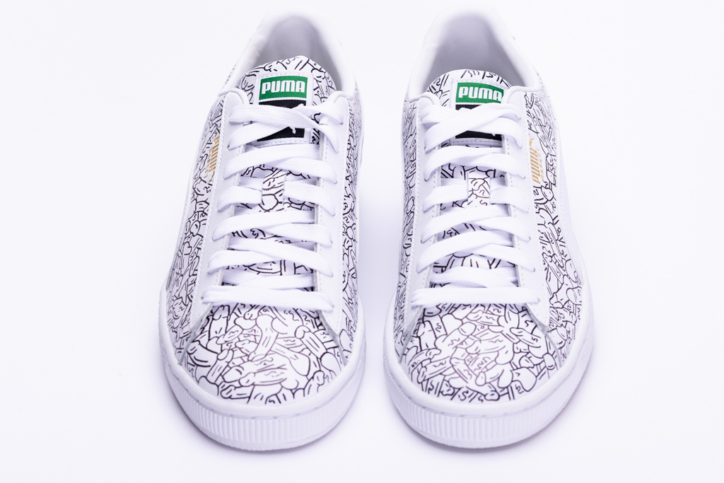
Romario Smith
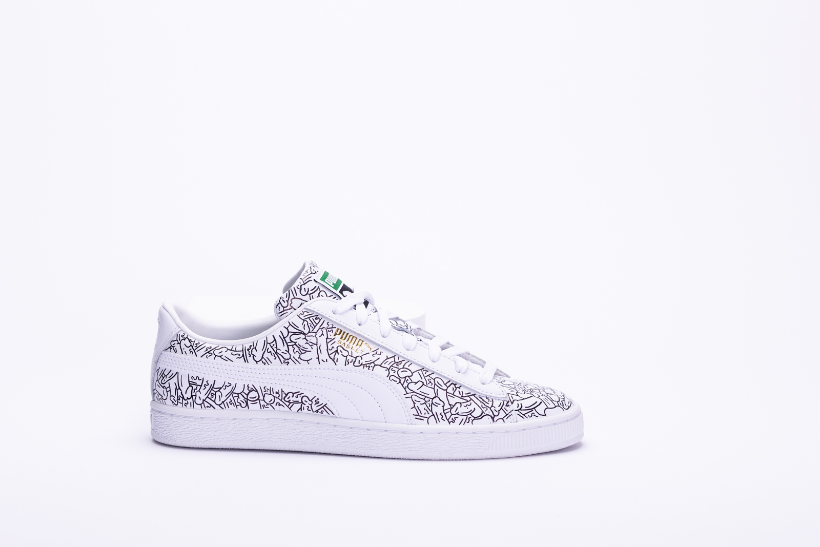
Being unapologetic about the fundamental and beautiful parts of me, is a skill that has taken me a while to gain and practice, especially when I’ve been taught to hide certain parts of myself. However, it’s due to this skill that I’ve been able to thrive. This is what Pride means to me. Individuals, who each have their own unique stories, talents and amazing souls, coming together, expressing and celebrating every single part of themselves unapologetically, despite the deception they might’ve been told in the past. My design speaks to my own unashamed celebration of my sexuality. A beautiful display of desire, pleasure and connection between two human beings, that is unfortunately shunned and scorned when displayed or expressed not behind closed doors. These sneakers (or as I like to call them, Dick Kicks) burst through those doors and make an unmissable display of sexuality and pleasure, while playing into my own sense of humour and not taking itself too seriously.
Some might be surprised at the absolute lack of colour included in a work that is my representation of Pride. Not even a rainbow. This decision comes from my own personal loss of ownership of the rainbow representing the LGBTQIA2S+ community due to many opportunists abusing the rainbow to exploit marginalized individuals. There is also the fact that Pride is not a piece of rainbow merchandise that I pull out of my closet for a single month. It’s a part of my life that I carry with me daily, everywhere I go. I strived to create something that exceeds just Pride month and can be seamlessly integrated into the lives of those who have to consistently face challenges to be their most authentic selves. So as Miranda Priestly would say, “Rainbows for Pride? Groundbreaking.”
Much like how the forms of the design gets lost in the repetition and how my own mind has become numb to this image through the act of creating, I’d hope that everyone would allow their minds to let go their own predetermined prejudices and biases. Thus opening up their mind to accept the beauty and intrigue that sexual desire, even if it’s not your own, can hold.

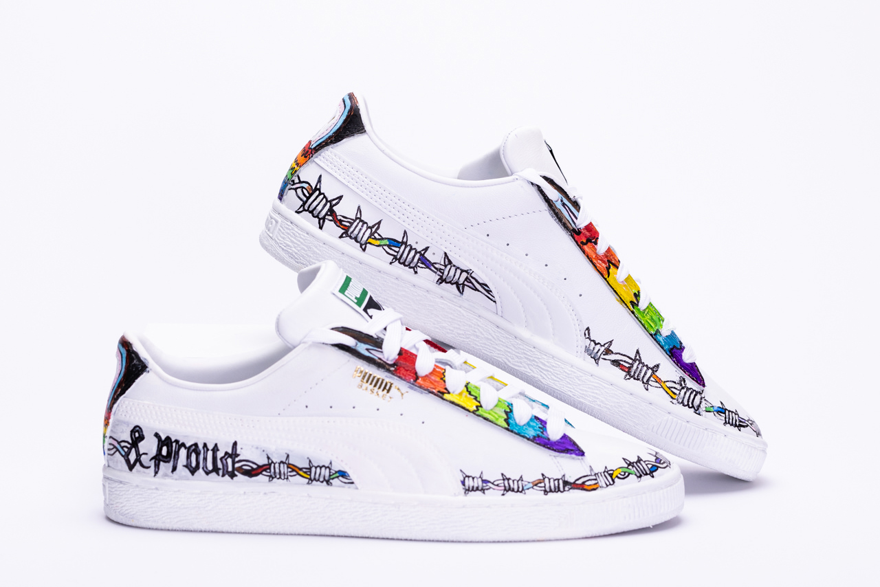
Amir Awad
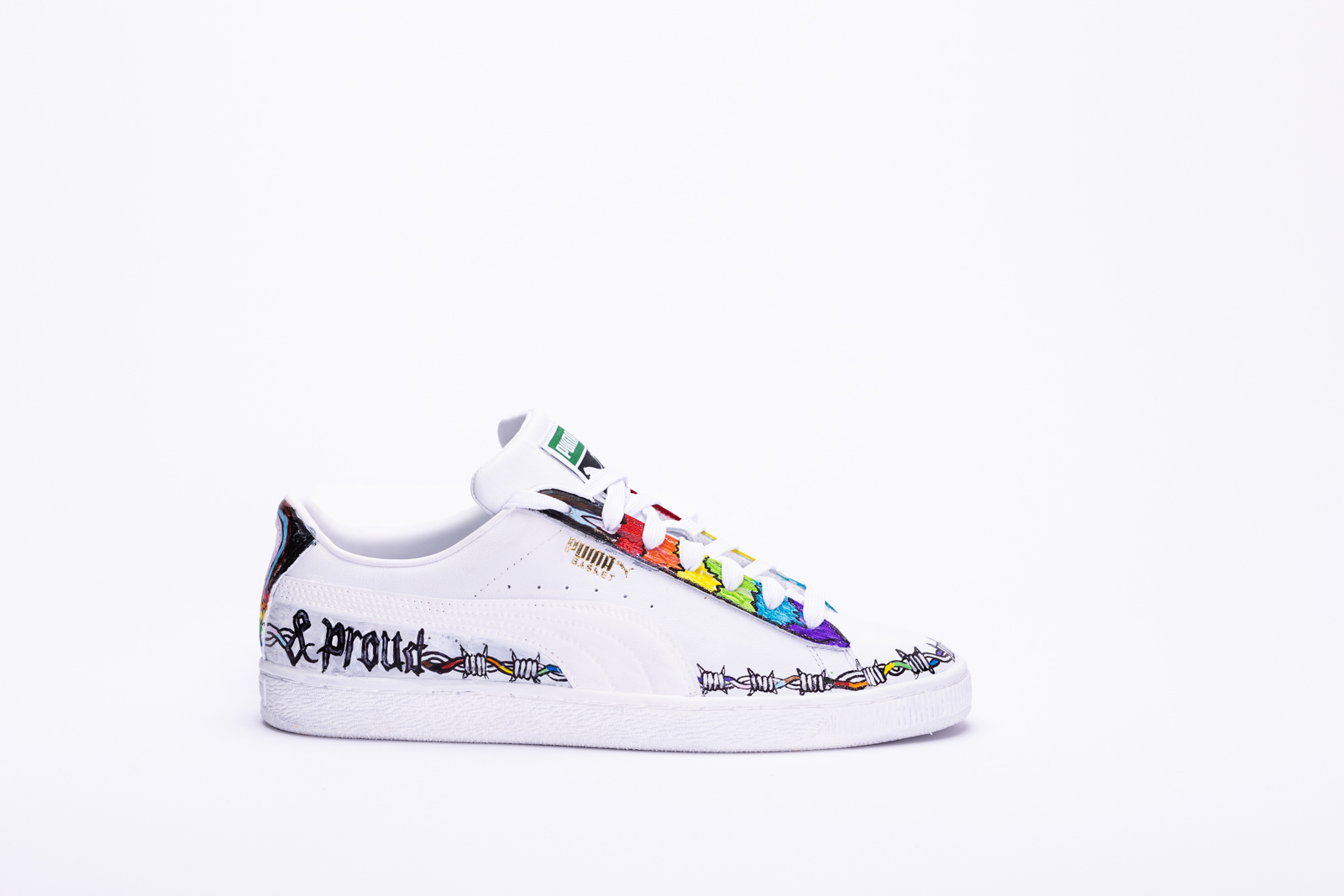
For my shoes, I included the colours of the pride flag to represent lgbtq+ Identities including trans and P.O.C. When pride month comes around, it is common to see sunshine and rainbows when in reality that is not always the case. In the middle east you are arrested for being gay. In more extreme cases, tortured or killed. I used barbwire to represent these hardships and also all hardships with this topic.
On each side of the shoe I wrote “& proud” which signifies that no matter who you are or what you are, you should never be ashamed.
You deserve to give yourself more credit and take pride in who you are.
On the back of the shoe, I also included the pride colours dripping as a final touch. This was so that those viewing the shoe from behind can get a glimpse of the message trying to be sent.

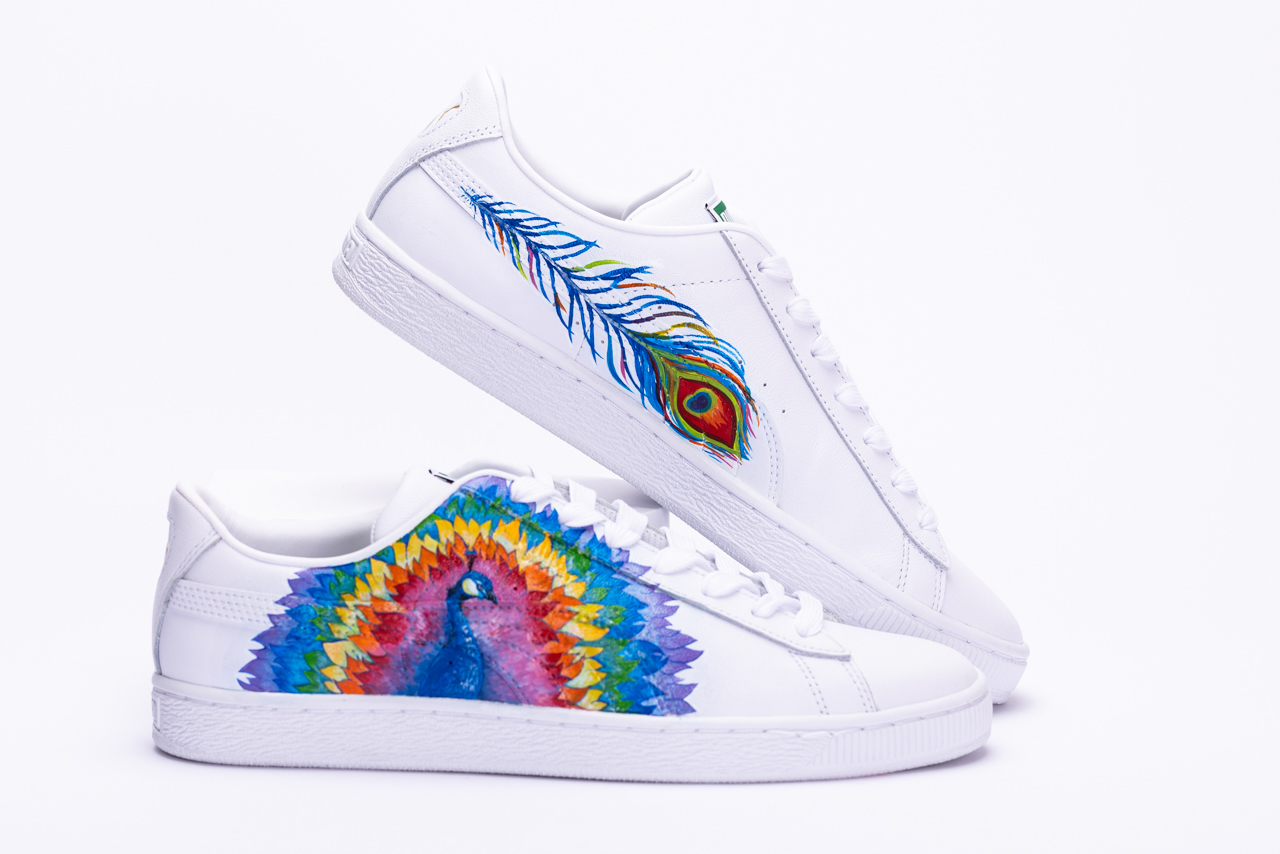
Rishnika Boteju
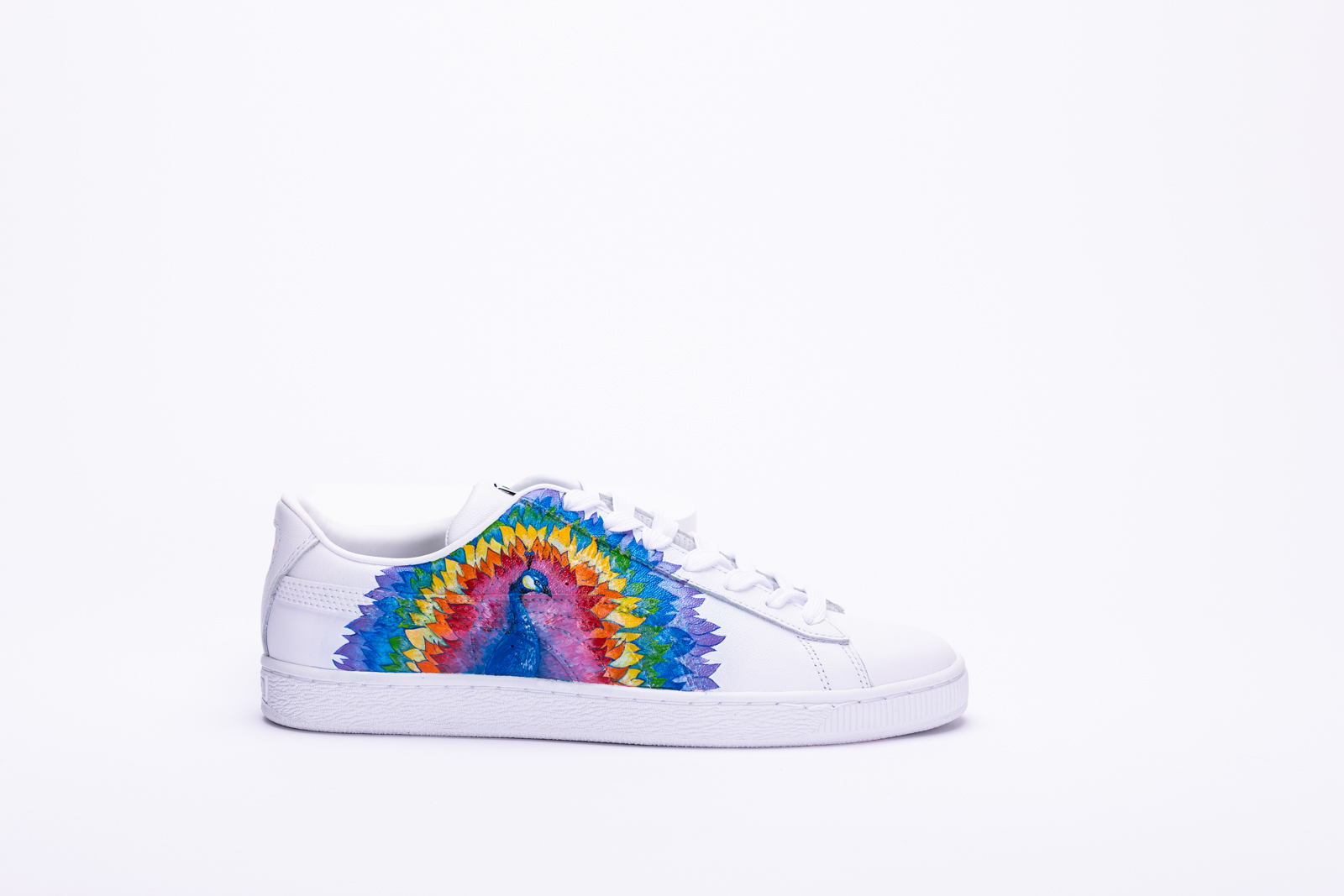
Pride, to me, is the ultimate means of self-expression. I identify myself with my art, much like people of the LGBTQIA+ community do. I wanted my art to embody the expression of self identity. Peacocks are proud animals and enjoy showing off their iridescent colours that make them unique, and have been known to be symbolic of pride throughout history. Peacocks generally have green, turquoise, blue, yellow, brown, and black feathers. However, I decided to replace their colours with the colours of the pride flag, which are red, orange, yellow, green, blue, and purple. I chose this design concept as I decided to use the peacock to represent LGBTQIA+ as a whole. I wanted this design to show everyone coming together to embrace each others’ differences. Each segment of colour represents different values within the community. On the insides of the shoes I decided on a single feather that contained all the pride colours, as I wanted it to represent individualism and to show that we are part of a greater cause. The purpose of this design concept was to showcase colourful and meaningful messages that pertain to pride. This month, we all come together to celebrate what pride means to us, and I hope my art conveys my support and appreciation for all the members of this community.
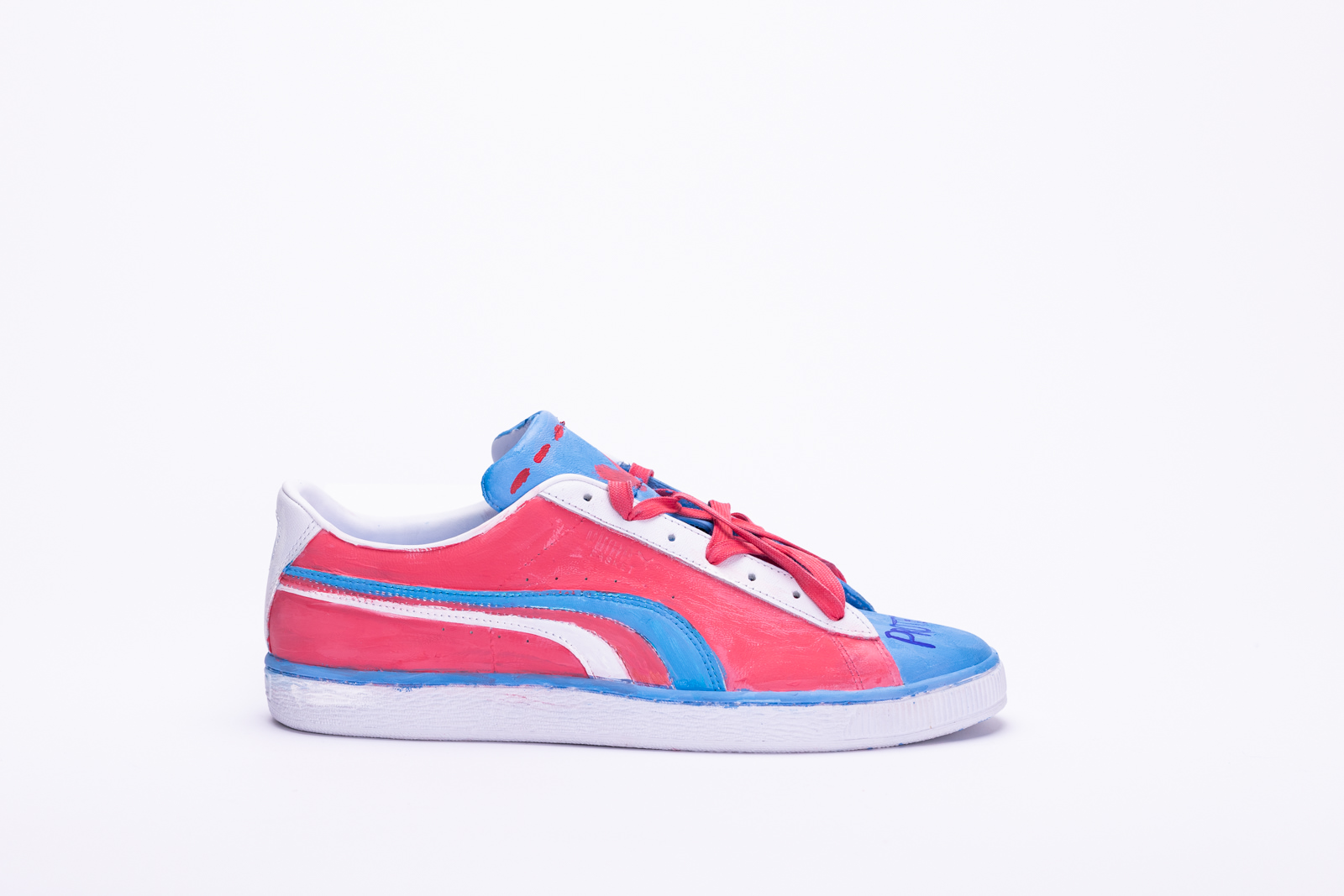
Olivia McCarthy
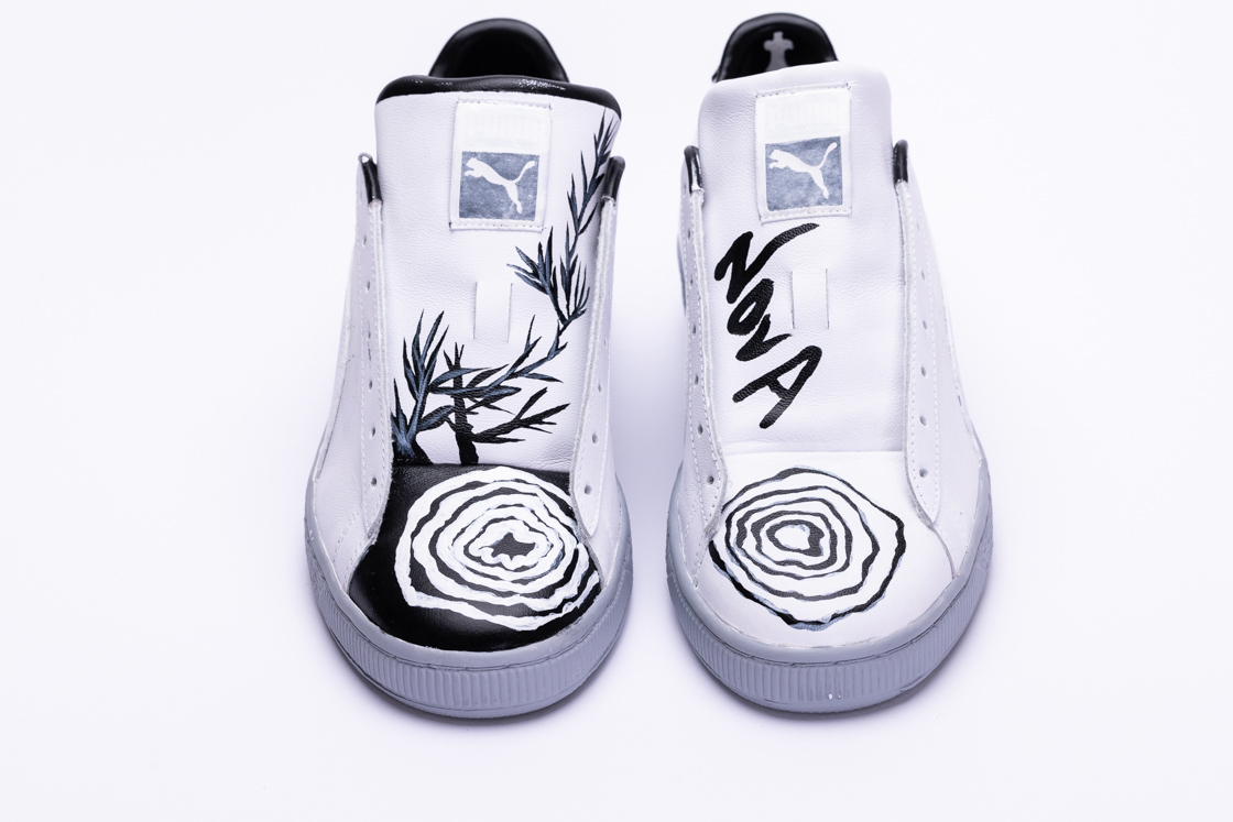
I grew up not knowing what would make me happy. I knew I didn’t like my body, but I was told that it’s normal for a girl my age. But as the years went on, the shame within me grew stronger with the message “it’s normal to hate your body”. I was kept from being myself for a long time because of ignorance about pride and what it means for queer people. When speaking about pride in a broader sense, I need to discuss how prideful my father is. He has shown me the beauty in pride and how pride can be the best motivation to get out of bed when you’re having a bad day. That same pride is what caused me to be in the dark for so many years. Men are expected to take pride in everything to save face. The belief system (the Catholic Church) in which my father learned pride was one where queerness was (and still is) seen as bad or negative. Deep down, the pride taught to me has given and taken away from me.
A lot of brands make money off of pride merchandise with the promise of donating the earnings to the queer community, but that doesn’t mean they aren’t benefiting massively thanks to these donations leading to massive tax breaks. So why are they really doing it? To save face and to make money.
The exterior of my box is painted abstracted rainbow colours and the brush strokes are intentionally very visible. I wanted it that way because the outside of the box is the first thing that people will see. In terms of what pride is to me, it represents how messy pride can be, yet still be beautiful! It also speaks to the fast fashion and other brands profit off the backs of queer suffering by not acknowledging the whole story. They have the ability to play it off as showing support to the community. This is why, when you open the box, it is completely black on the inside and the shoes are monochromatic. This represents my journey.
The left shoe (or, as I refer to it, the heart-side shoe) says, “pain behind the pride” which I painted layers of and covered in white paint to represent the steps and layers of trauma that LGBTQ+ people carry in their hearts. On the inside of the heel there is a white church with a cross on top. As a child, I was asked to “give my heart to God” and now I want to take my heart back. Pride is giving me the ability to choose who and what I want to promise my heart to. Moving to the exterior, there are five concentric circles in black that were painted over in white to appear grey as many more layers would be necessary to cover it completely. This represents how the darkness I was holding in (due to the pride I was expected to have) comes out and how it looks to others. The white represents me trying to clean up the mess, cover it up, or even cope but still not getting it right.
The interior of the right shoe is black and, again, represents the darkness I’ve felt and also been expected to keep in. On the front there is a similar pattern. However, this time the black is filled in completely, showing how the darkness has done its harm and I am ready to slowly “paint on” the layers of healing myself. Then, a plant grows out from the dark. It’s not pretty, but it is strong and sharp and that is how I am. The bottoms of the shoes are painted grey to represent concrete. This is because I wanted to acknowledge how heavy it is to carry this story.
In conclusion, I am happy and prideful in being queer and being me, and I feel that that is what I portray to the public. But inside of my head and heart, it can be hard sometimes. It’s okay to not be okay and it’s okay to love yourself and it’s okay to not love yourself sometimes. All in all, we just have to dig our way out as slowly and steadily as we need because there really is a supportive rainbow somewhere out there.
Maggie Pan
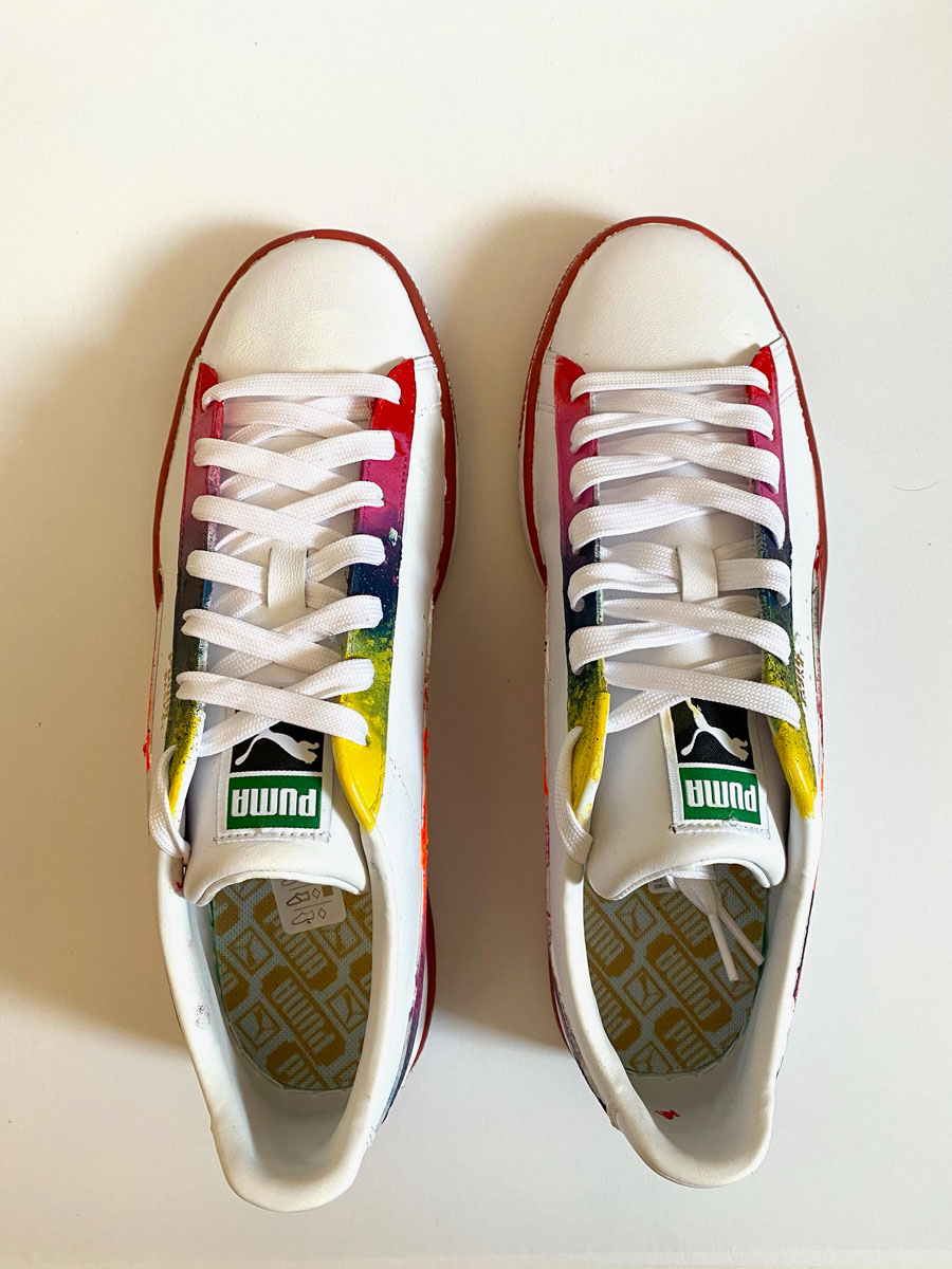
I wanted the sneaker to be worn as an everyday shoe, and not too pride-specific. This translates to my belief that your sexuality and the way you choose to express yourself should always be embraced and celebrated, not only during pride month. I accented the sneaker with red, the colour of love, because ultimately that’s what pride’s all about (and I think coloured soles look cool).

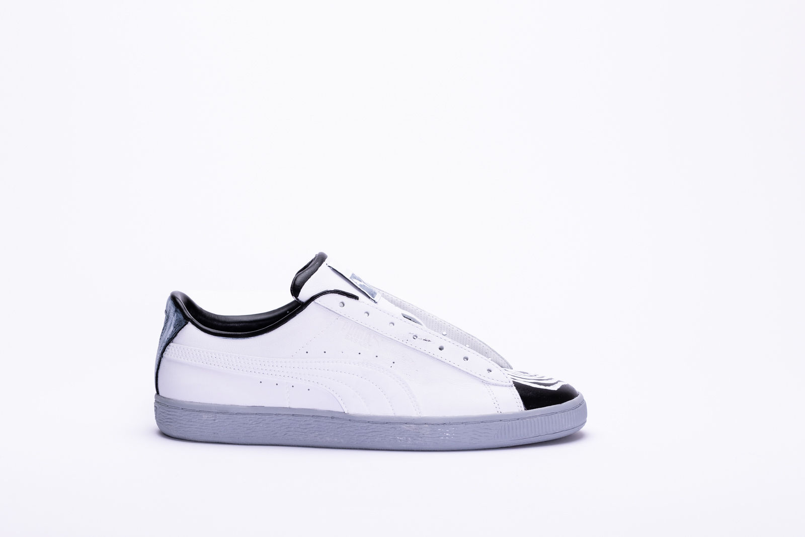
Sage Milner
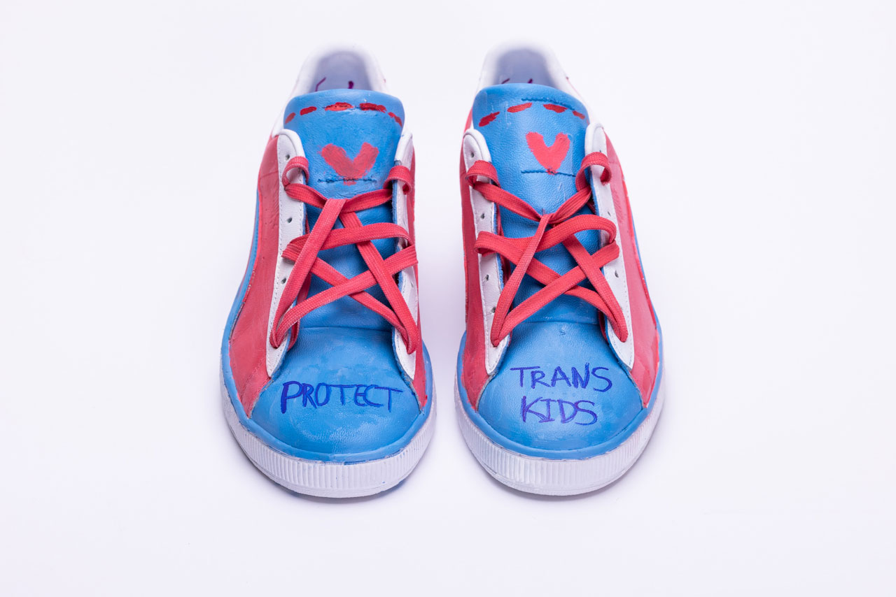
For my design, I wanted to value protection for trans youth. As a young trans person, I know how difficult it can be to grow up in a body that is not your own. The dysphoria every day, looking in the mirror and knowing you'll never be who you were meant to be. Knowing that even if you transition, you are missing out on a childhood that was ripped from you from the moment you were born in the wrong body.
The colours represent the transgender pride flag. Despite the trouble that comes with it, I am very proud to be trans and support my community. I find that the trans community is often underrepresented and I believed it deserved some more recognition for how amazingly beautiful trans is. The red paint on the top of the tongue represents not only top surgery, but the pain that comes with identifying with transgender. It is a minority that many people are unkind to due to misunderstanding and ignorance. The words 5x are imprinted on the inside backs of both shoes. This number is very critical, as it represents loss to our community. Trans youth are five times more likely to have suicidal thoughts than a cisgendered person. I wanted this to be impactful, yet not take away from the main message, which is why I decided to place it on the most visible inside.
The hearts signify all the trans members we have lost over the years, out or not. Without those trans lives, we would not be where we are today. After all, we would not have Pride at all if it weren't for many black trans women, Marsha P. Johnson included, who was an activist at the Stonewall Uprising of 1969. She was later found dead in the Hudson River, which police deemed "Suicide", but many people have speculated that was not the case.
Trans people have always been attacked by society, and told we are not valid for being ourselves. Which is why I included the pentacle laces. Pentacles are a sigil of protection in witchcraft, which ties in with my main message of my shoes, "Protect Trans Kids".
I believe everybody should have the right to be comfortable in their own body, which is why i am very proud to identify as transgender and speak out against hate.

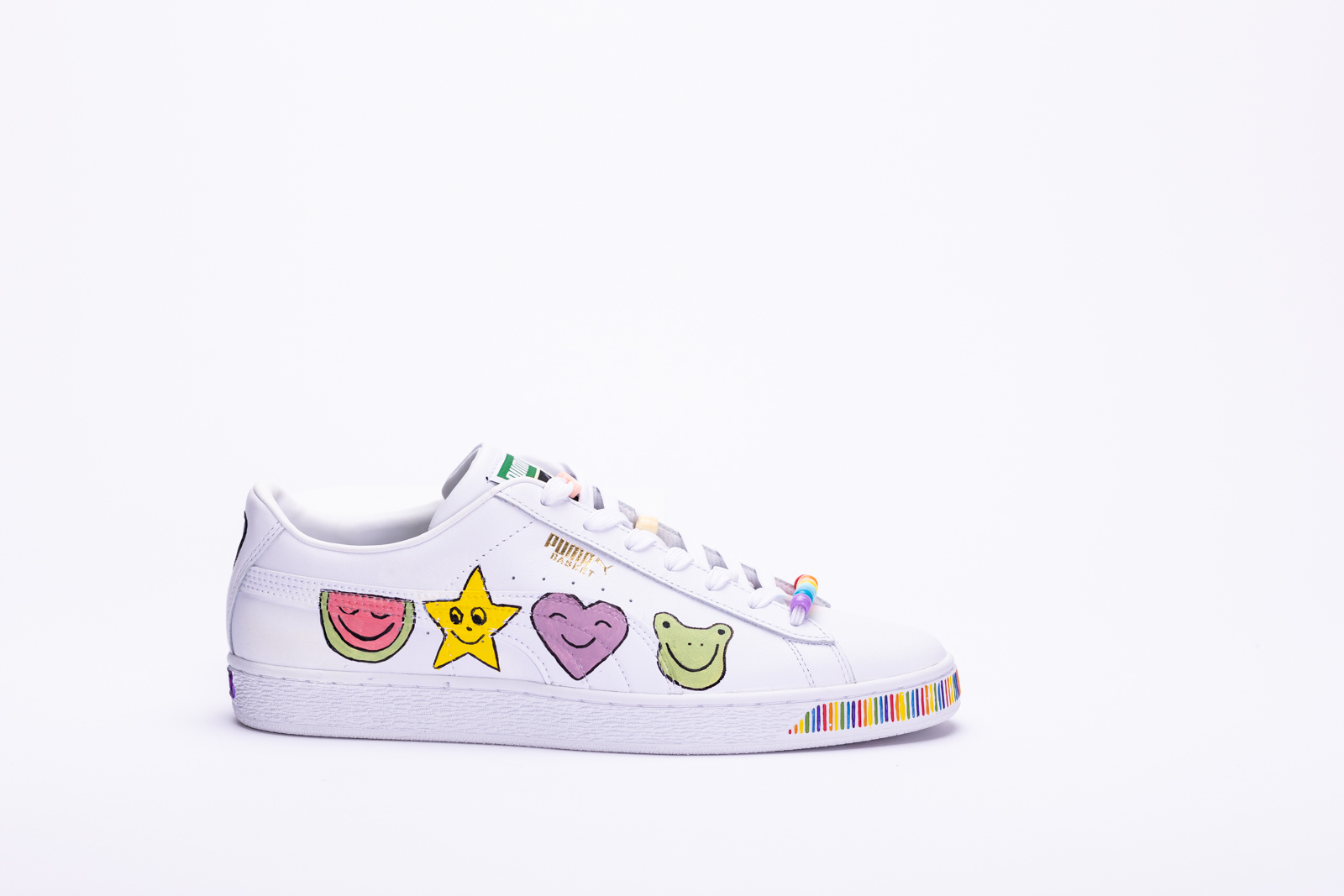
Erin
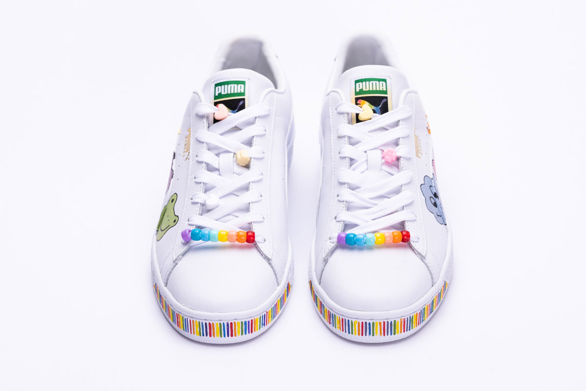
I wanted to keep my design fairly minimalistic and true to my art style, which is why I chose to leave majority of the sneakers white. I included rainbow patterns to represent the pride flag on the front and back of the sneakers. I also included the Progress Pride Flag around the PUMA logo on the back, which features pink, white and baby blue -the transgender flag to provide affirmation to the trans community. The colours brown and black tare there to recognize the significant role people of colour have played in pride, as well as provide representation to people who have lived with HIV/AIDS.
The characters I depicted on the outer side of each shoe were mainly to represent what pride means to me; community, diversity, inclusivity and acceptance. I thought these characters were a happy and fun way to show that meaning. Pride is celebrating not only ourselves, but everyone who identifies and works to bridge the gap of marginalization, promoting respect, recognition, and right to equality.

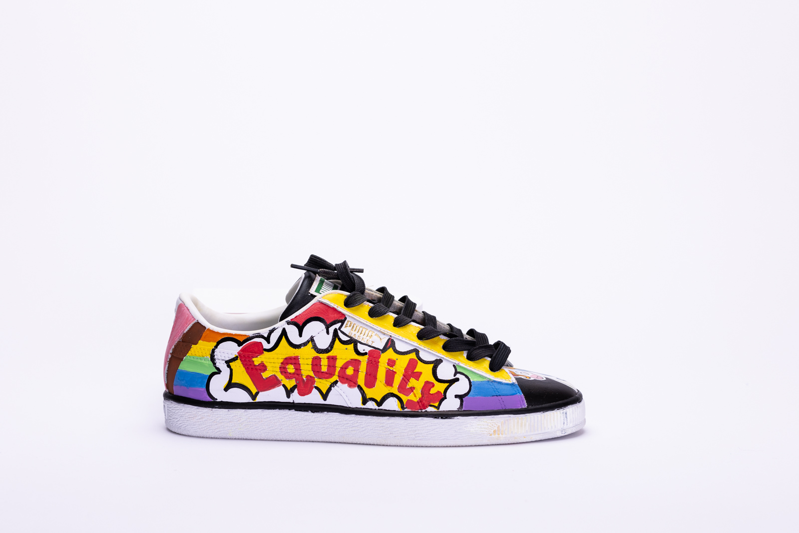
Asmita Kaushal
Art is the medium to express and connect the world and these handcrafted sneakers express the love, respect and admiration that I have for the worldwide pride community. Let the world know who you are during Pride Month!
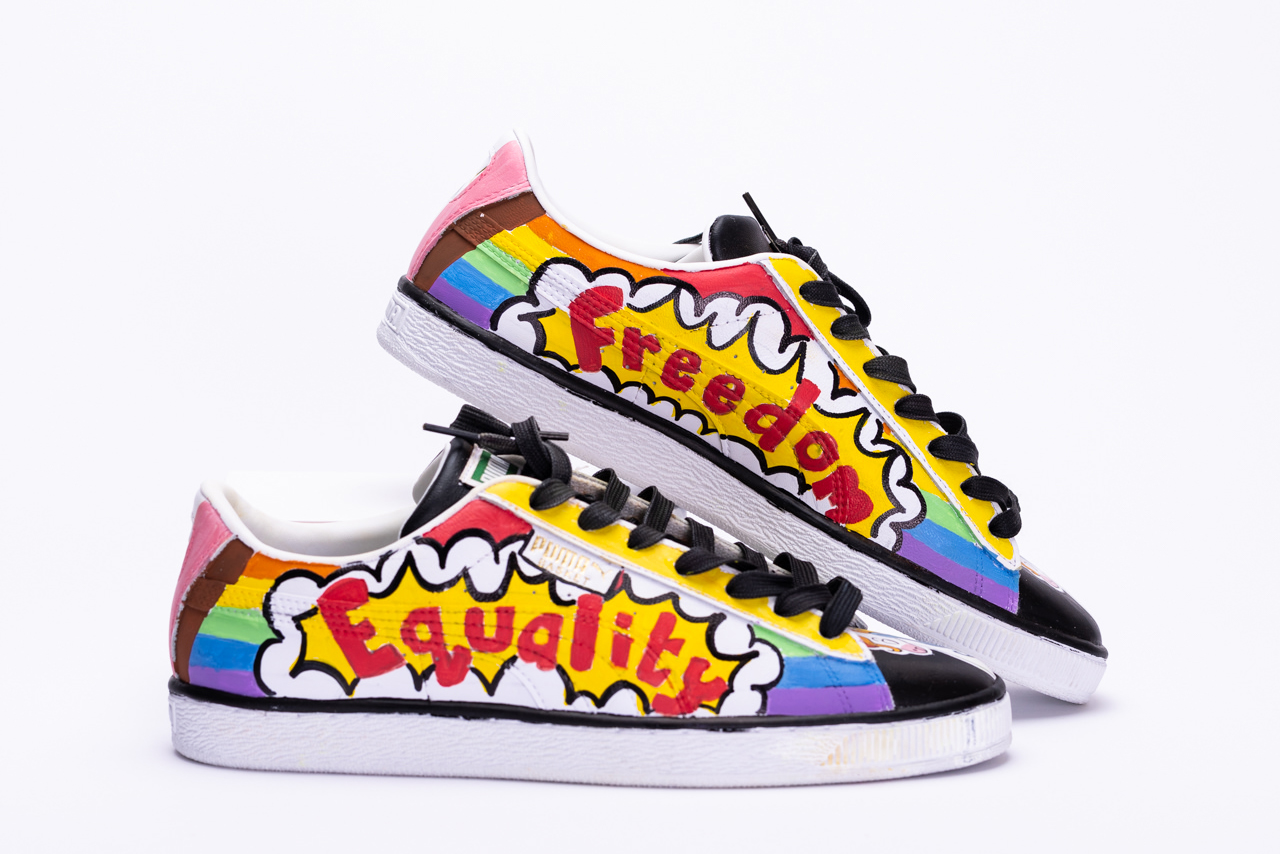
Attracting a diverse group of people through my Art and fashionably unique design. I embrace the word “Pride” by utopian unicorns as they are representatives of our unique community. Unicorns come in a crazy variety of colours and styles and encourage everyone to be bold, brave; take pride in ourselves, our choices and in everything that we do. The fluidity between the forms resonates with the LGBTQ community who don’t conform to the gender binary. That is why I have depicted unicorns on my shoes.
I addressed everyone in my art piece by using all the colours. Making the background with symbolic rainbow colors of pride to represent togetherness, since LGBT people come in all races and ages, and rainbows are both natural and beautiful. Even adding brown, black to support the community stance for the black and brown people taken after George Floyd’s death.
Pop Art that is present on the sides symbolizes cheerfulness, boldness, uniqueness and vibrant culture.
Endorsing the community to bolster by the following:
PRIDE means being proud of one’s uniqueness
Be BOLD, speak your mind without worrying about how the world sees you
Pride is FREEDOM, it is a celebration of inclusivity and freedom of expression
Pride is all about promoting self-affirmation and ensuring EQUALITY.

Hani Pathan
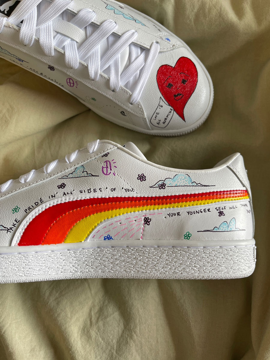
These sneakers represent unconditional love. I wanted to show pride through self acceptance and validation.
By using flowers to represent growth and the different stages of learning to accept yourself. You are constantly evolving and shedding past skin. I featured the bright colours from the pride flag to show that love has no boundaries.
Happy pride!

Monia Mugabekazi
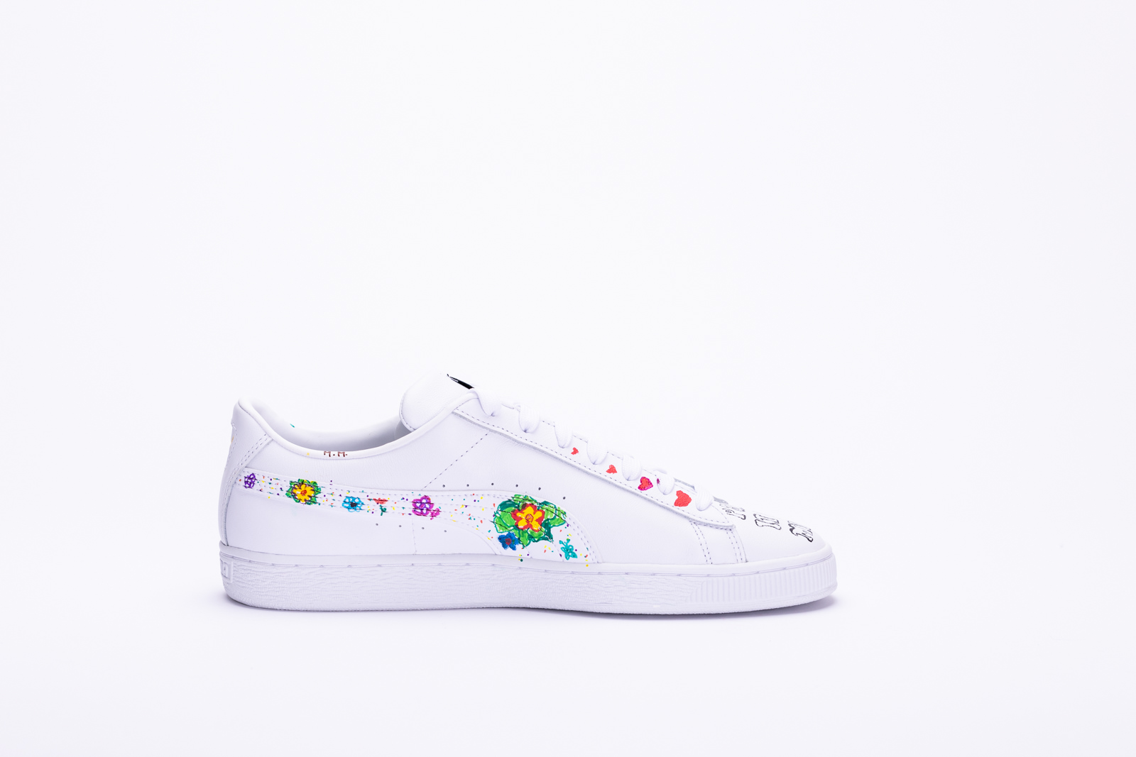
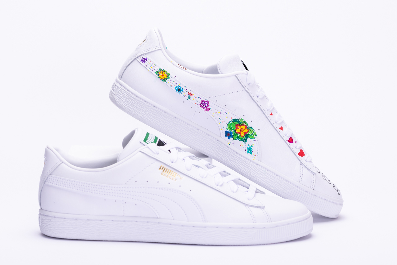
My concept for this shoe was to remind myself the history and pay my respects to the people that paved the way for us. That I why I included the quote by Marsha P. Johnson. I also included hearts in the front . They become bigger , it is to represent that with each step towards our true self , I wish that our love for ourselves grow too. Pride means being proud of yourself and loving yourself as you are for me. I included the flowers on the side because I hope that one day the journey to self-discovery will be a flower road for everyone. During pride I remind myself that not everyone gets to walk in their truth. Pride is also a moment to remind ourselves of the ongoing fight . Because until we are all free , none of us really are. On one side of the shoe there is less flowers than the other. That side represents my own journey . How I'm beginning to understand myself and grow . It's only the beginning!

Madison Cook
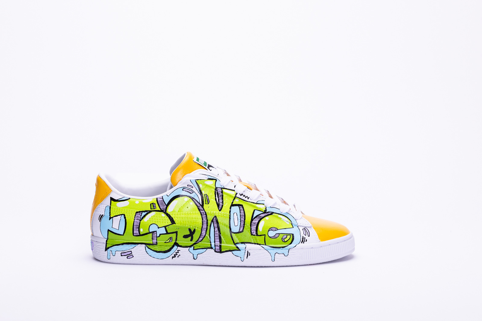
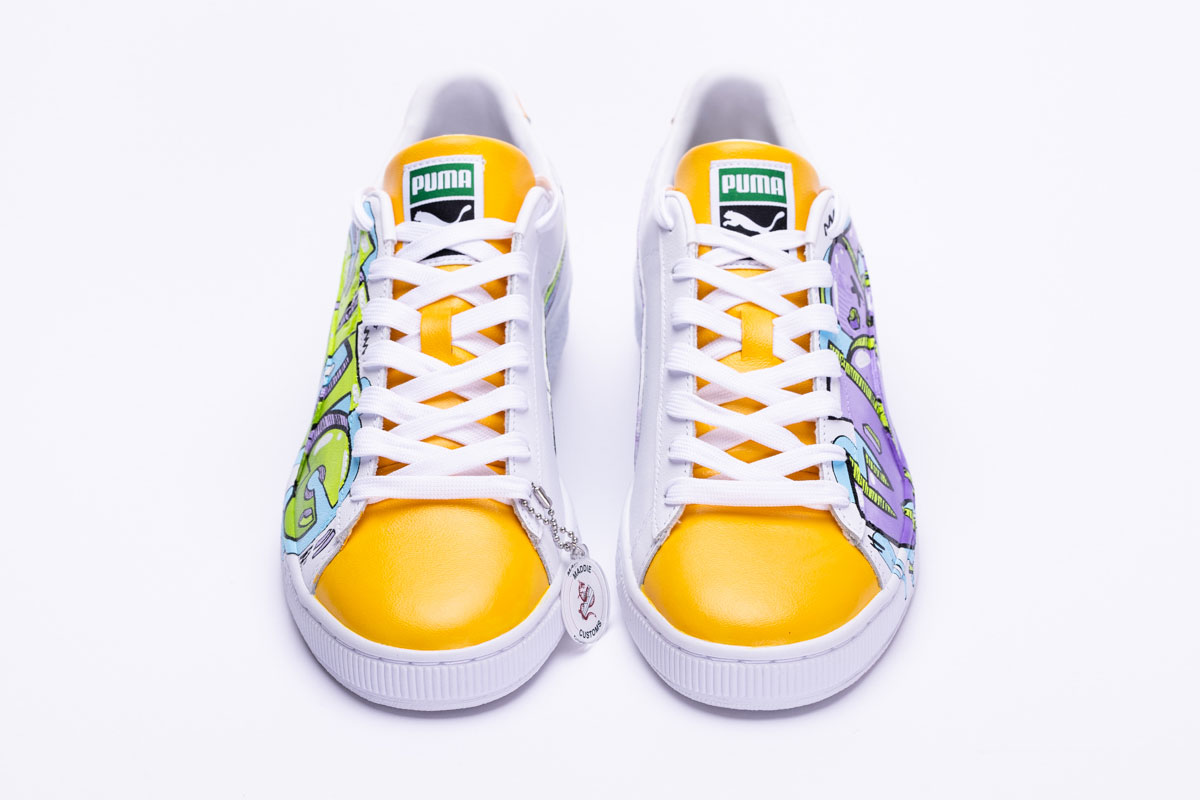
In honour of Pride Month, I created a shoe that explores empowerment and self-love. As an LGBTQ+ ally, I believe that pride is about loving who you are and not being afraid to express yourself. I chose some of my favourite colours to create this design as I feel they represent energy, love, and acceptance. I also included an homage to the pride flag on the heel of each shoe. Words carry such strong connotations and meaning. I believe that “worthy” and “iconic” are words everyone should say to themselves. I placed “I am” on the lid of the box to act as a declaration… “I am worthy. I am Iconic.” We are all one and should be free to express ourselves without fear or judgment. No matter your gender or sexuality, you are worthy and iconic.

Finch
Growing up I loved the outdoors, I went to summer camp regularly, slowly working myself up from day canoe trips, to over night canoe trips, to a trip that lasted 35 days. I never felt more like myself than I did at 15, canoeing over 600km up to James Bay with a bunch of new friends.
That experience directly affected my ability to finally come out as transgender, friends on that trip helped me pick out a new name, though only the one I found from reading a friend's book stuck, They supported me, and uplifted me, and in that month I realized being true to myself was the best thing I could possibly do for myself.
The next summer I worked at that same camp that organized all those trips, feeling like I finally knew what I wanted to do with my life, come my senior year I applied to a few eco-tourism related courses for post secondary. I finally felt free, happy, and like I was going to do something I loved.
But, life being the way it is, I couldn't do that anymore. Joint pain turned to daily dislocations. Headaches turned to migraines. "Zoning out" turned to seizures. Being out of breath turned to fainting. In the matter of a year previous health issues I chalked up to being out of shape turned out to be underlying disabilities.
A year after that, I begun using a wheelchair, as I started rapidly loosing my mobility. But, even though I can no longer do the one thing I thought was my life purpose to the same extent I used to be able to, I still push myself to go out on trails, go for small camping "trips" in my backyard, go to the beach.
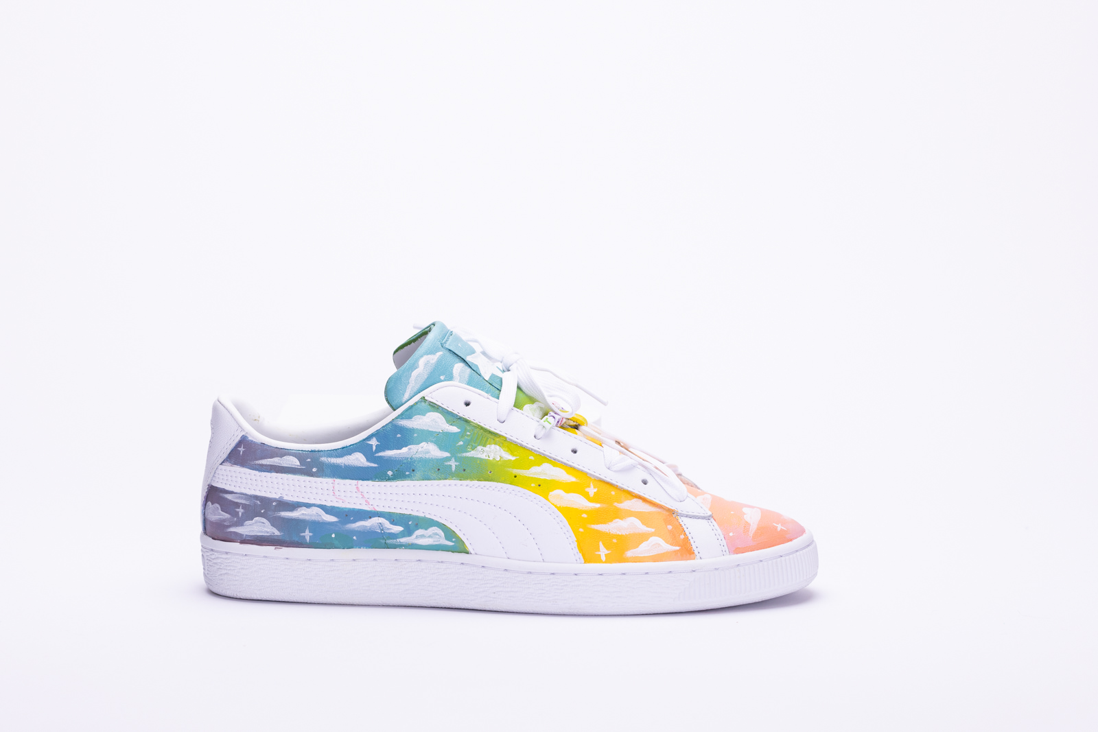
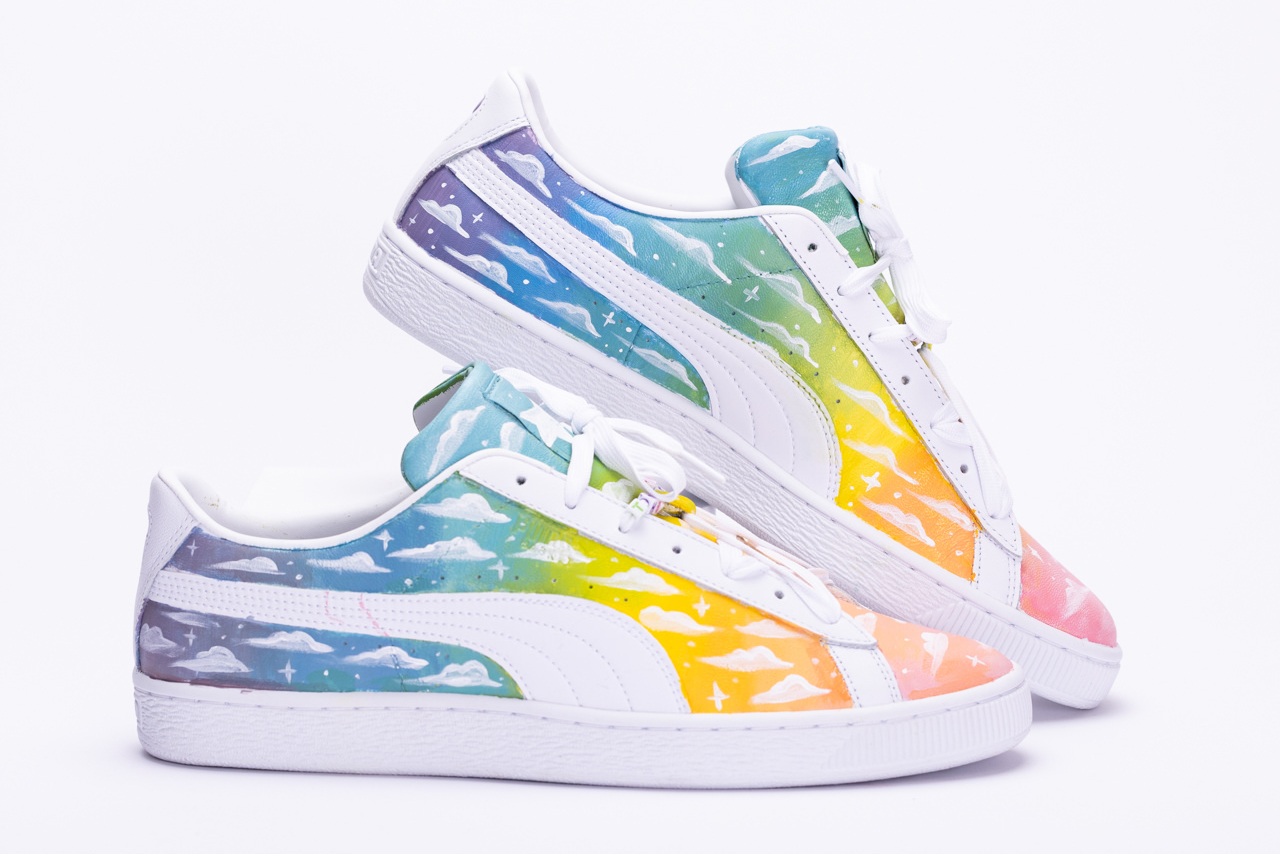
Its not the same but, my passion for the outdoors hasn't been stifled by becoming disabled. My shoes as simple as they are, are a rainbow cloudy sunset. The sky for the outdoors, painted in the colours of the pride flag as both were so intertwined for me. The clouds being how clouded things became for me but, it still being pretty shows that despite everything I'm still here, and it didn't stop me.

Christy Simon
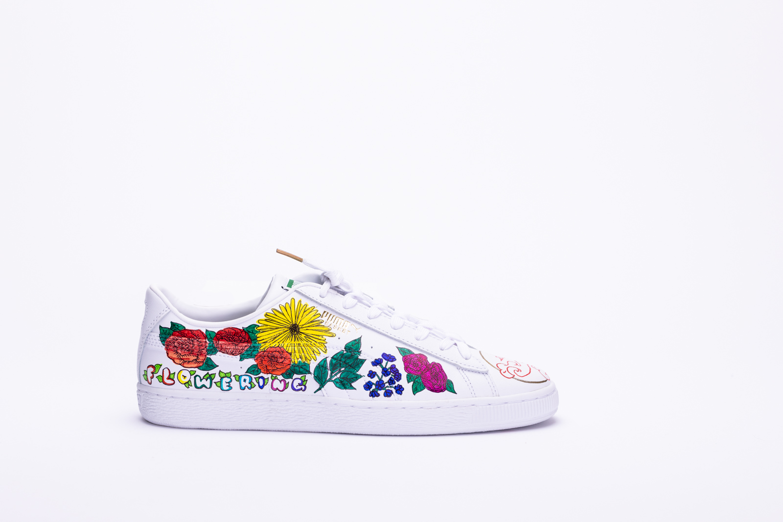
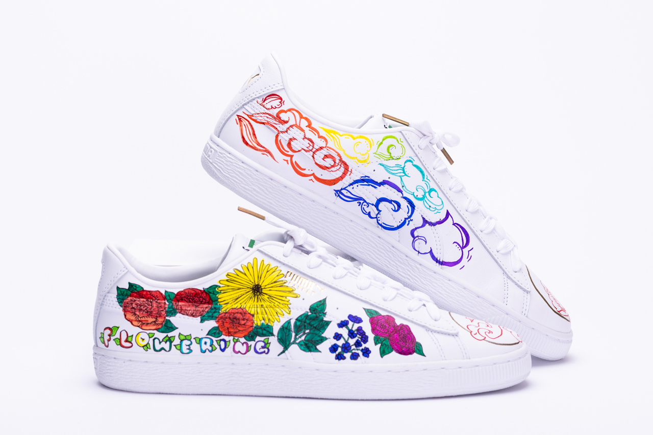
To represent my pride I chose to draw fire and flowers. The fire represents the passion that continues to drive me to pursue my interests, while the flowers are to symbolize my growth. Flaming and flowering represents me in a nutshell as it describes my journey through discovering myself, exploration of my love for art, and learning more about my roots and heritage. Every experience I went through helped me grow and realize what and who I want to be, I am still learning as I go and hope to constantly improve moving forward in life. On my flaming shoe, the smoke represents how seeing someone so passionate about what they do can stir inspiration in others to follow suit. An example is Marsha P. Johnson, an American activist who sparked the fire of a whole movement that still burns brightly today. I recreated a famous flower crown from an old photo of hers, to pay homage to an icon I truly admire.
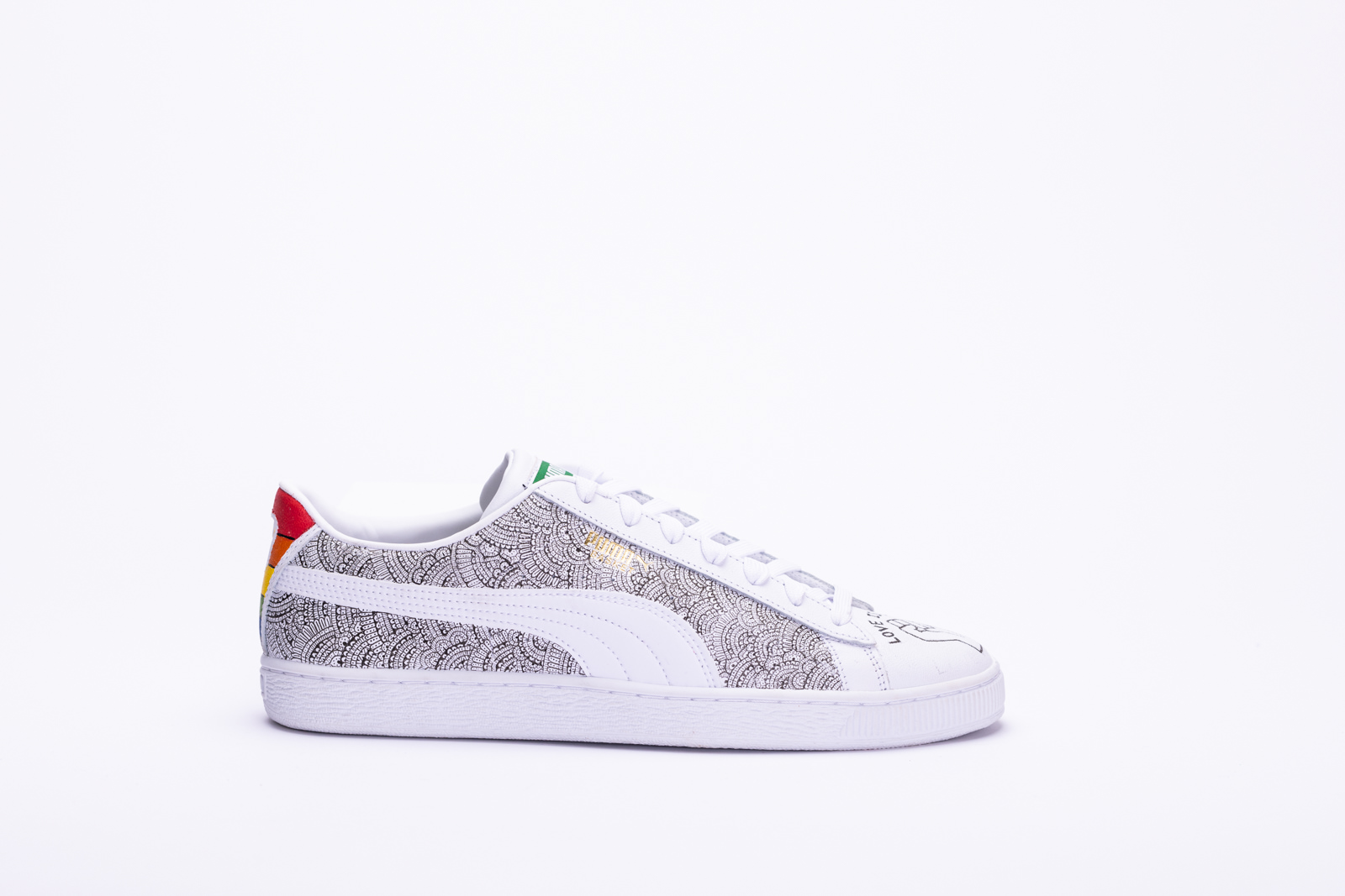
Laurel MacKay
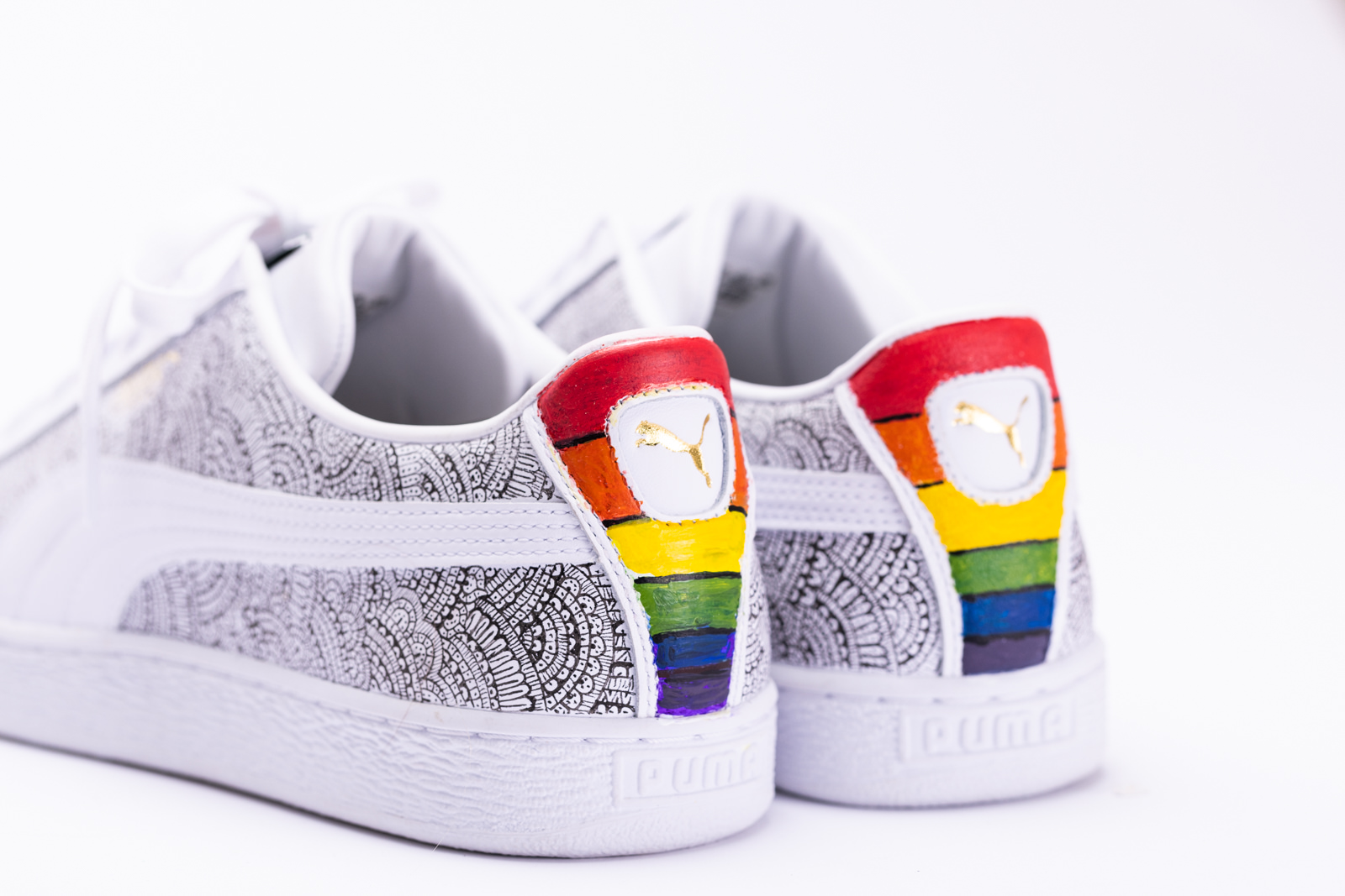
The raised fist on the front of the sneakers represents unity and support to the LGBTQ+ community along with the quote “love is love”. This quote gives off a very strong message that love has no boundaries and everyone has the right to love regardless of their sexual orientation or gender indentity . The flower designs on the sides of the sneakers are a symbol of Gay pride. During what was considered to be the very first LGBTQ+ pride March in 1970, demonstrators carried flowers in solidarity. To this day, flowers are used as a way to express the movement which is why it was important for me to incorporate flowers into my design. Lastly, I wanted to include the colours of the rainbow on the back of the shoe to symbolize the pride flag.

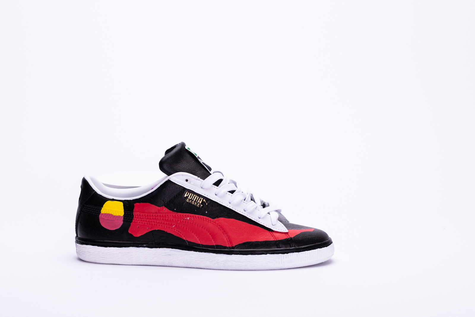
George Chakhunashvili
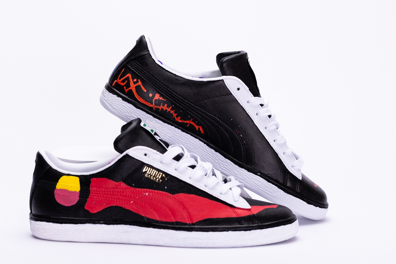
The illustrated design is an example of a path we all should have in our lifetimes. We as humans are not lonely creatures, and neither are beings of solitude. We were able to think for ourselves and decide what happiness or pride could mean to each of us. This journey could be hard at the time and require a tremendous amount of work, but finding your perfect match and trull love is worth it as a reward. Fining perfect match should not be based on race, religion, sexuality or any other defining feature that society is implementing on us as individuals. We must also understand that we all are different, and nobody is the same. We speak different languages and have diverse symbolism, but this difference makes us who we are.
Thus, art on shoes illustrates two travels separated by distance, time and matter, but when they meet - from being singular beings, they create one whole piece. The shoe design follows the concept of the deconstructed rainbow: an example of multiple elements that create a whole.
By uniting and growing together, they become one; they bring something new and different from each other, but through love and acceptance, their differences balance each other out and lead them to a better future. The pride of being accepted as who you are is the north star that should guide us as humans and as individuals in our path of finding true love that is only defined by ourselves and nobody else. As a rainbow has seven elements that create beauty, the same way each of us has multiple components that create who we are, accepting them all will only make us stronger and prideful.

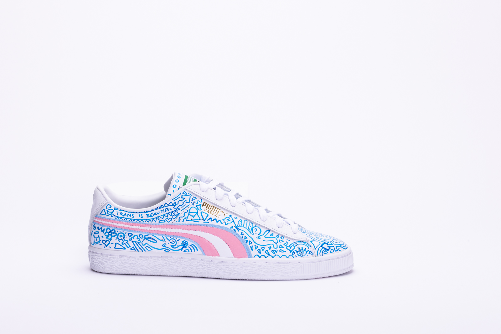
Nick Ghasemi
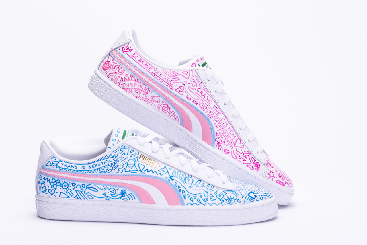
Entering the MARTK’D x Puma x Ebay contest my goal was to create a pride shoe to specifically represent the transgender community. The inspiration behind my shoe design came from a runway look done on RuPaul’s Drag Race by Gottmik, the first out trans-male contestant to appear on the show. Their design was inspired by Keith Haring, as is mine, and it was worn in the finale episode of season 13. On the shoes, I have featured drawings of people with question marks on their heads to represent gender fluidity and that gender and sexuality is a spectrum. There are also syringes, bottles of hormones, and bandaids doodled along the shoes to represent testosterone shots and medically transitioning. It was a part of my journey and the journey of other trans and non-binary people. Many of the other drawings and doodles also represent aspects of the queer community. Along the sides of the shoes, I have also outlined the trans flag and used strictly blue, pink, and white as a colour palette to keep the cohesiveness of the flag. Finally, on the back of the shoes, I have drawn the symbol for equality, as there is a current fight for equality among the queer community around the world, and it means a lot to me and many other members of the community.

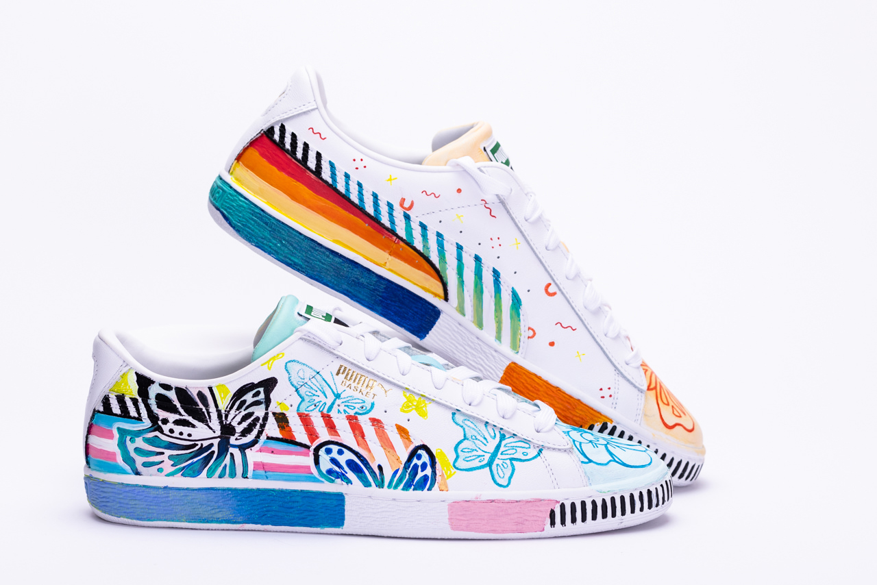
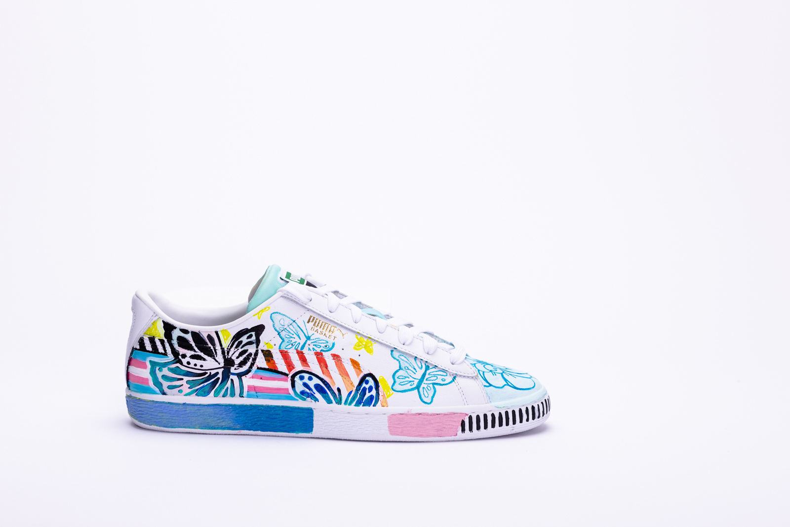
Mathias Ball
Ultimately, Pride means many things to me, but at the base, I find that love, acceptance, and community is the anchor of it all. With each shoe, I took the opportunity for the themes “love” and “acceptance” to take the forefront. When it came to depicting community, I found that the shoe itself represents this, as through my own coming out journey, community was the foundation for both finding love and acceptance (socially but also personally) and without that community I personally would have been lost.
On the inner side of the shoe, I wanted to also acknowledge those who are aware and proud of their identity but don’t have the means to fully come out. Being in the closet can naturally be frustrating, especially when seeing so many individuals around you being able to outwardly celebrate. I wanted to show that self-love and acceptance of one's identity is a celebration of its own, even if the celebration is much quieter.

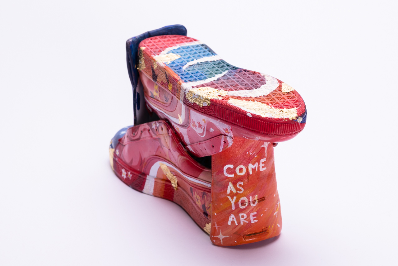
Sara Sian
My piece is entitled "Come As You Are"
My art piece symbolizes the acceptance and identity aspect of pride. I wanted to depict the golden
and blossoming feeling of being accepted for who you are.
To me, pride means being able to fully embrace and accept your and others sexuality.
Many of my friends in the LGBTQ+ community never fully seemed like themselves until they
started being comfortable with who they were.
I wanted to focus on lesbian and bisexual pride as those represent some of the friends that have
greatly impacted my life.
TECHNICAL CHOICES:
My design concept really encapsulated the vibrance and pop of colour I was really going for. Each
side of the shoe tells a small love story according to the flag represented. Both sides are tied together through
colour transition in the soles to really help the colours and sides harmonize with each other and I added flowers
and gold leaf to create the real "wow" factor to the shoe.
I also worked with complimentary colours on each side to give the shoe a real balance. I took a risk
by playing with shoe composition to create a larger canvas for me to create a story on, but overall Im proud
that I did because I wanted to go more for an exhibit-like piece than a simple wearable shoe design :)

Darren Uzelman
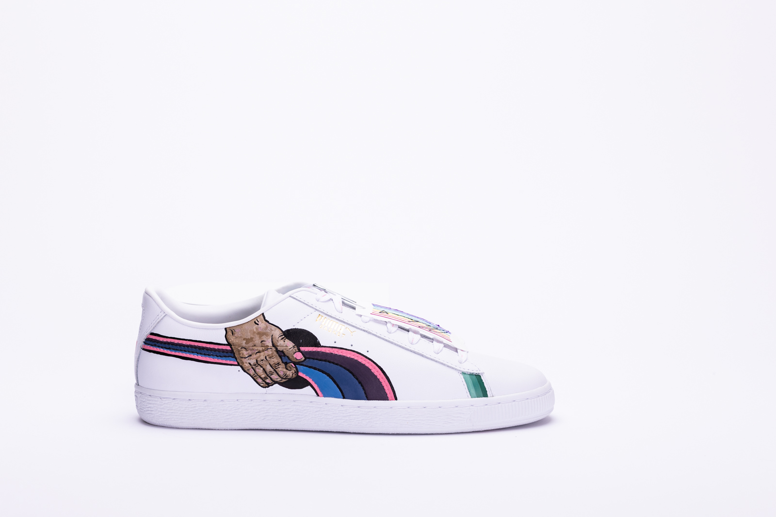
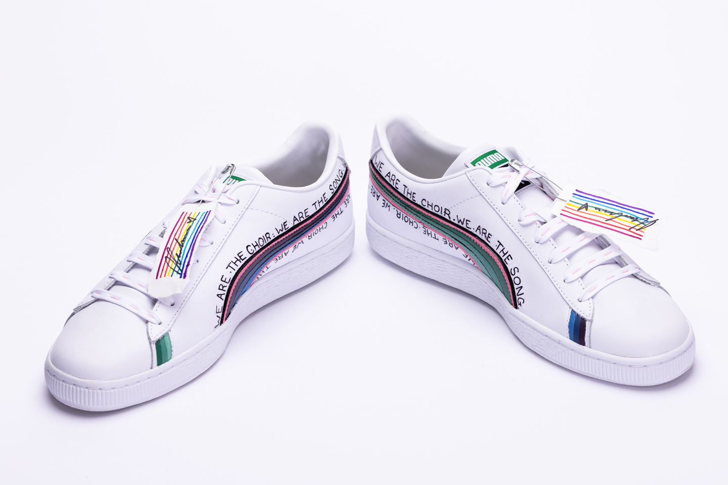
Pride is a part of who you are. Through my design I wanted to share that part of myself and my own experience. The colours in the stripes of my shoes represent the MLM flag as a part of my own identity, alongside the pink which is my nod to the trans flag as well.
Music has always been something I surround myself with, which is a main reason I chose to use guitar imagery. To me, a good song and pride are two things that you can feel in your bones. It’s what defines me, moves me, and comforts me. It’s something I couldn’t imagine living without. I wanted to create something that carries that sentiment.
The words for this piece actually came from a line of a podcast that I listen to. I adored the idea that we as people are the songs that our bodies sing, and I found that it connected so deeply with how I feel about who I am and what that means to me. Your authenticity isn’t something should be turned down for anyone.

Ange-Lyne Patenaude
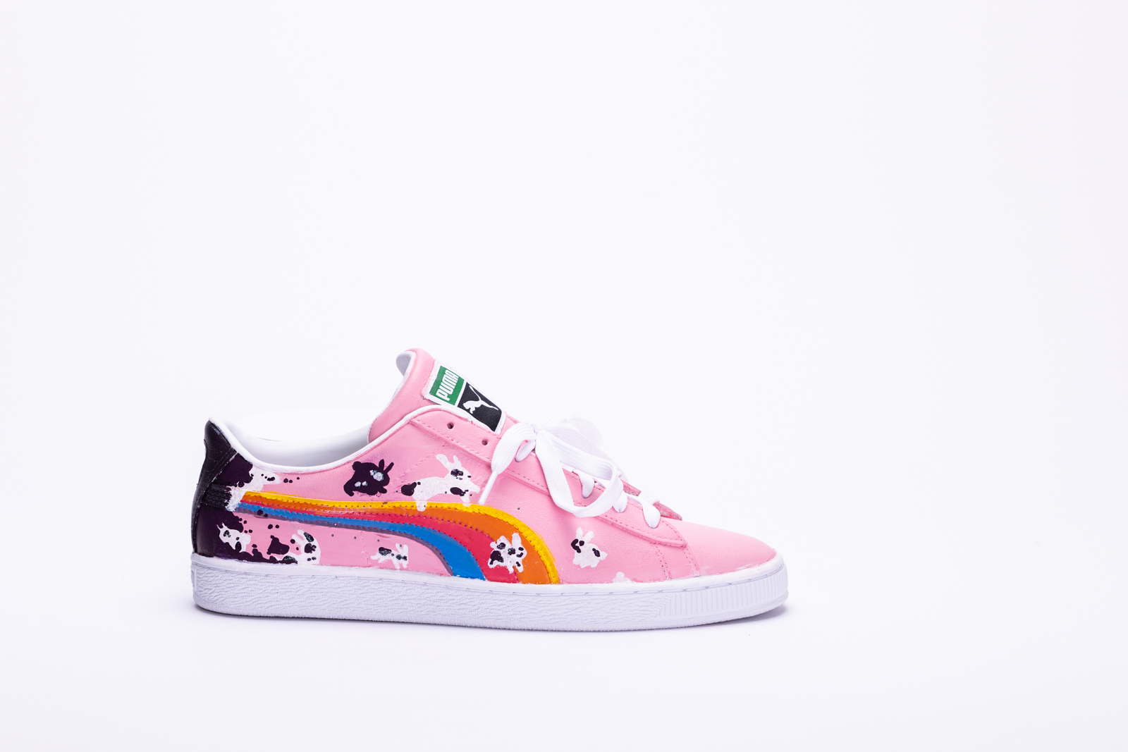
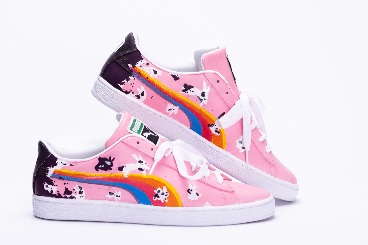
My design represents the trauma we carry with us after coming out with our pride. We all carry a bit with us when coming out of the darkness of conformity and social pressure to be the same. Hence why all the bunnies look a little different- we all carry our struggles in different ways.
Isaiah Wilson
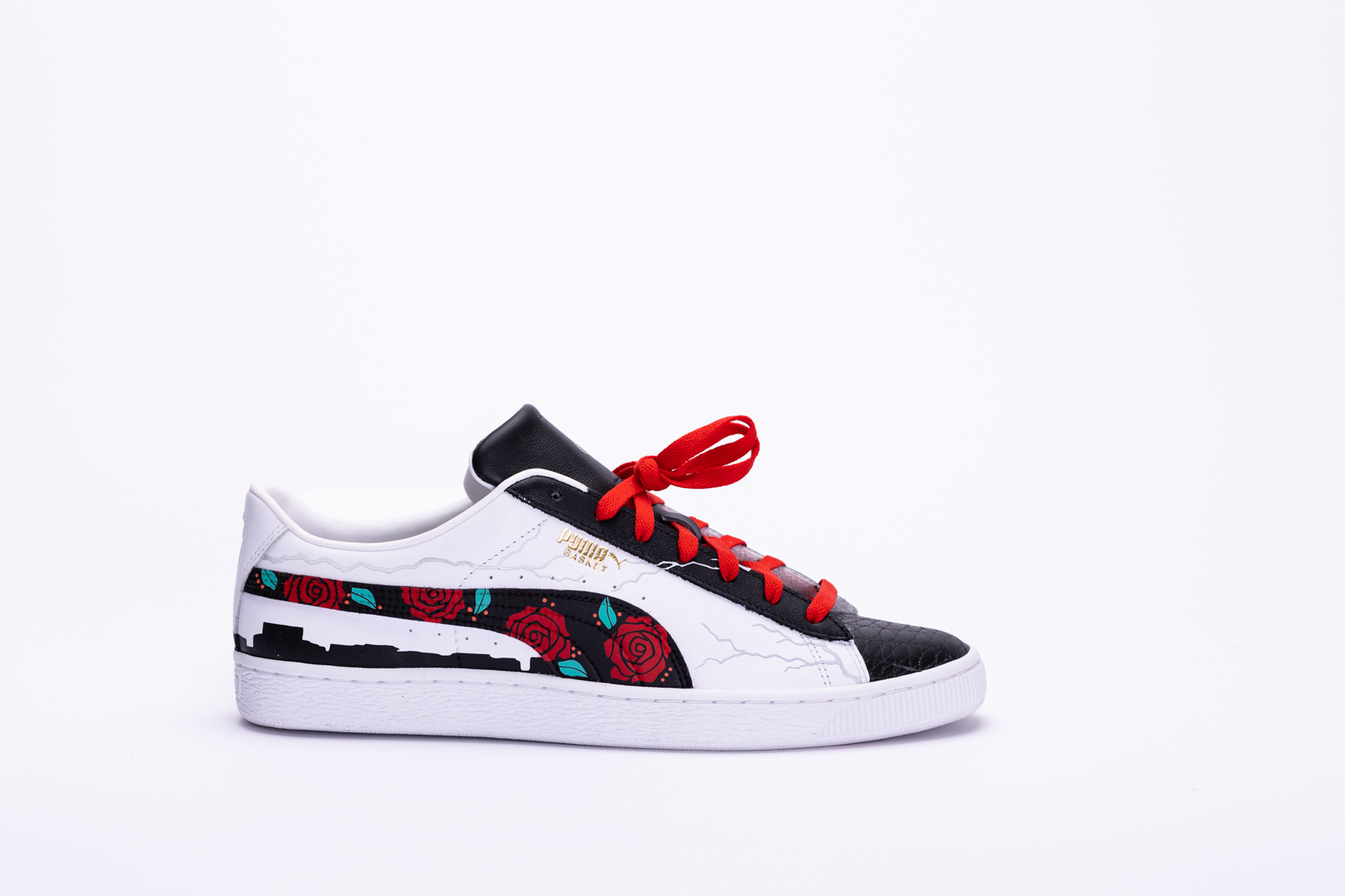
Hello, I am Isaiah Wilson, also known as iCustoms on Instagram. When I think about pride and what it means to me, I instantly think about how proud I am about what I have accomplished with my sneaker customizing business and how much I have progressed over the last 8 years. I thought, what better way to display this pride than through customizing a pair of sneakers that represents where I started off as a sneaker customizer and how much I have developed my skills over the years.
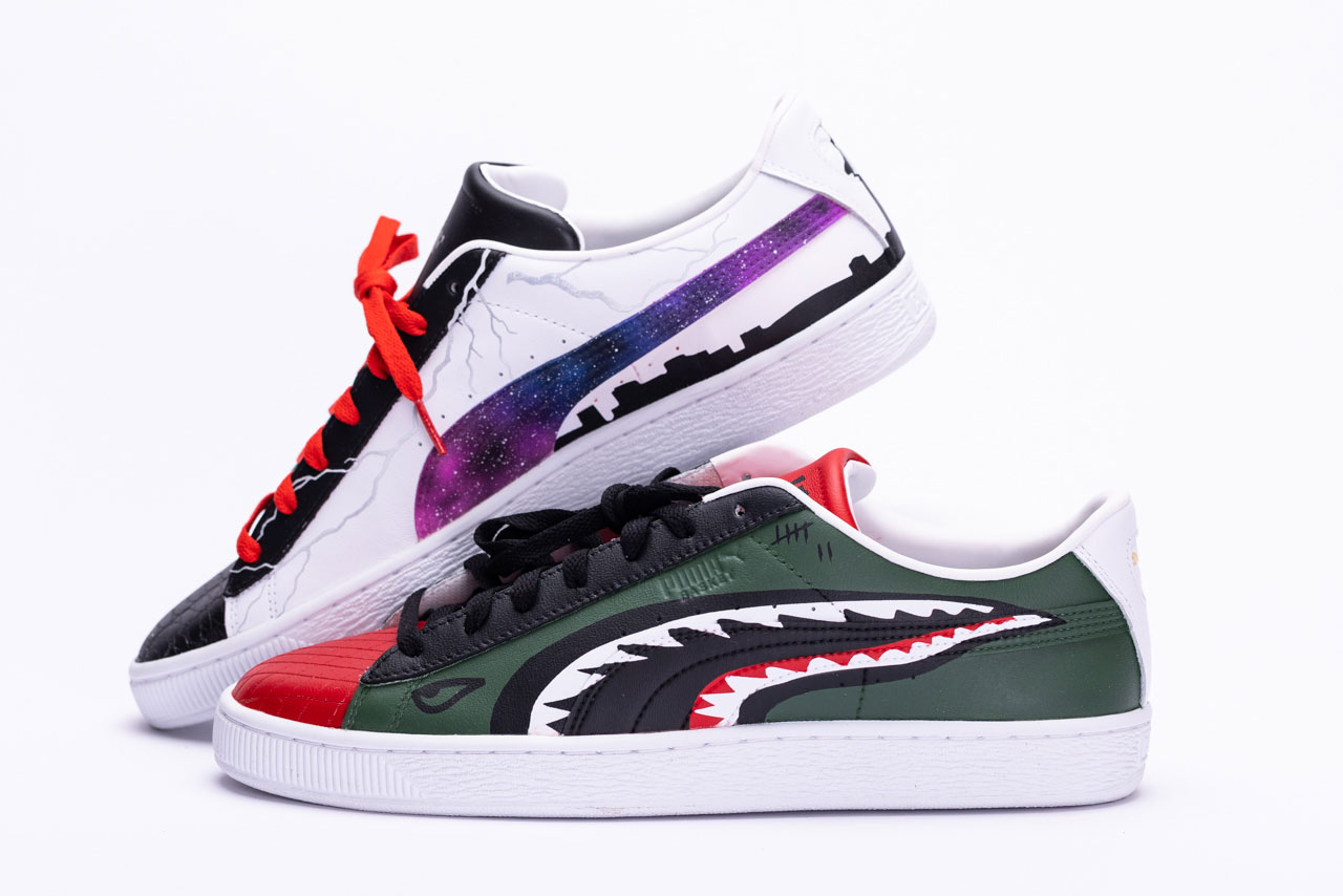
I decided to customize each panel with a design that I have done over the years. I wanted to incorporate aspects from my very first custom ever, all the way to the type of art I can do now. The arrows on the inner left sneaker represent the first custom that I ever did. My good friend gave me the opportunity to customize his Jordan 5 Fire Reds, which I painted red and added black arrows on. That is where my love for customizing was born. From there, my second custom ever was a pair I did for myself, also on the Fire Red 5s. I tested myself and hand engraved a diamond pattern around the whole sneaker, as well as painted the shoe red. That design is captured on the toe of the right foot. Next, I added a drip effect to the inner left foot to, once again, show my steady progression of customizing skills. The drip effect also has a fairly basic faded effect, but it is always a fan favourite. Continuing with the theme of progression and expanding my skills, I did a galaxy effect on the inside of the right shoe, as well as added reflective lightning bolts to the right shoe to display my growth and experimentation with new materials (Reflective vinyl). From there I hand engraved the toe of the left foot with an alligator inspired pattern. This was another design that I had tried for the first time and tested my capabilities with. Moving on to the more skilled work, I recreated two designs that I have done that required a bit more skill and knowledge, those being the rose design on the outer right foot, as well as the fighter jet “shark face” inspired design on the outside of the left foot. These were added to capture my development as both an artist and customizer. Finally, I added a skyline of the city of Toronto on the heel of the back right shoe. This was a representation of a design that I did for a close family friend as well as on a collab I did with a Canadian martial arts equipment company called Kimurawear. I wanted to add this to the shoe to show appreciation for what sneaker customizing has done for me and all the amazing people I have met through being in this business. To wrap things up, I added “1 of 1” to the tongue of the right shoe with the reflective vinyl. Customizing shoes has always been about having exclusive shoes that nobody else owns or has seen, so “1 of 1” seemed fitting. To conclude, I added “What The iCustoms” on the tongue of the left shoe. When designing this sneaker, I realized that it was essentially my version of a “What The” sneaker that Nike is known for doing. I took pieces of all my work over the years and incorporated them into one pair of shoes.
Overall, I am thrilled with what I was able to create in my limited amount of time and it was rewarding to create something that represents me and all the work I have put into being the best customizer that I can be. I want to give a huge thank you to the MARTK’D team, Puma, eBay Canada, and everyone else that was involved in this competition and making this all possible. I have gained lifelong knowledge and experience through this process.

AXNK
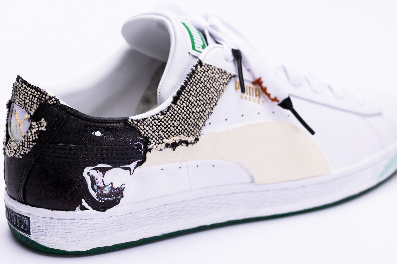
Born in 2002, Elisa is an international artist based in Islamabad (Pakistan) and Calgary (Canada). Elisa is fascinated by the themes of behaviour, memory, and fantasy. Her work is experimental in style and clinical in detail, drifting along the edges of abstraction and surrealism. Animated by paints, graphite, ink, and textiles with elements of text, sculpture, and digital art. “I haven’t gone down the traditional academic arts route, so my work lacks that bit of guidance. Hence, an opportunity to engage with creatives nationwide and receive mentorship is of the utmost value to me.”

Maryasha Yarmush
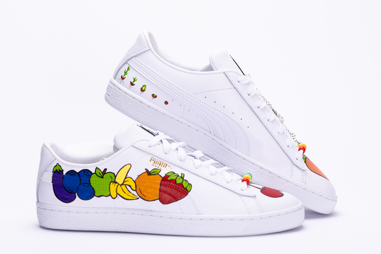
To me pride means two things: acceptance and growth. When we truly learn to accept ourselves for who we are we can truly grow and flourish into the best versions of ourselves. I chose this particular design for my shoes to illustrate the process of growth through planting fruit and vegetables. Planting fruit and vegetables demonstrate how to can take something so bare for example a seed and turn into into something vibrant and colourful. Although the fruit and vegetable colors do represent the pride flag, the also suggest sexual preference. I chose to put the peach and cherry on the toe box to represent myself as a woman. On the inside of the shoe, you can see the sprouting process of seeds. I added a lace charm that says "be you" as a reminder to be proud of who you are and to accept all parts of yourself. Just like plants, pride is a constantly evolving to guide us into the best versions of ourselves.